%matplotlib inline

import seaborn as sns # 导入 seaborn 库,用于绘制统计图形。
import numpy as np # 导入 numpy 库,用于处理数值计算。
import pandas as pd # 导入 pandas 库,用于处理数据。
import matplotlib as mpl # 导入 matplotlib 库,用于绘图。
import matplotlib.pyplot as plt # 导入 matplotlib 库中的 pyplot 模块,用于绘图。

sns.set(color_codes=True,style="whitegrid") # 设置 seaborn 的颜色风格,color_codes=True 表示使用颜色代码。

np.random.seed(sum(map(ord,"categorical")))

titanic = sns.load_dataset("titanic")

tips = sns.load_dataset("tips")

print(tips.head())

iris = sns.load_dataset("iris")
   total_bill   tip     sex smoker  day    time  size
0       16.99  1.01  Female     No  Sun  Dinner     2
1       10.34  1.66    Male     No  Sun  Dinner     3
2       21.01  3.50    Male     No  Sun  Dinner     3
3       23.68  3.31    Male     No  Sun  Dinner     2
4       24.59  3.61  Female     No  Sun  Dinner     4
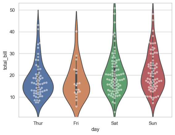
这段代码使用 Seaborn 库绘制了以 "day" 为x轴,"total_bill" 为y轴的小提琴图(violin plot)和散点图(swarm plot)的组合。
具体解释如下:
-
sns.violinplot(x='day', y='total_bill', data=tips, inner=None):调用 Seaborn 库的violinplot函数绘制小提琴图。参数x指定 x 轴数据,这里是 "day",参数y指定 y 轴数据,这里是 "total_bill",参数data是所使用的数据集,这里是 "tips" 数据集。inner=None表示不在小提琴内部显示盒图。 -
sns.swarmplot(x='day', y='total_bill', data=tips, color='w', alpha=.5):调用 Seaborn 库的swarmplot函数绘制散点图。参数x指定 x 轴数据,这里是 "day",参数y指定 y 轴数据,这里是 "total_bill",参数data是所使用的数据集,这里是 "tips" 数据集。color='w'表示设置散点图的颜色为白色,alpha=.5表示设置散点图的透明度为0.5。
这段代码绘制了根据 "day" 分组的 "total_bill" 数据的小提琴图,并在每个小提琴旁边以散点图形式展示了数据分布情况。
sns.violinplot(x='day',y='total_bill',data=tips,inner=None)
sns.swarmplot(x='day',y='total_bill',data=tips,color='w',alpha=.5)
<Axes: xlabel='day', ylabel='total_bill'>

sns.violinplot(x='day',y='total_bill',data=tips)
sns.swarmplot(x='day',y='total_bill',data=tips,color='w',alpha=.5)
<Axes: xlabel='day', ylabel='total_bill'>
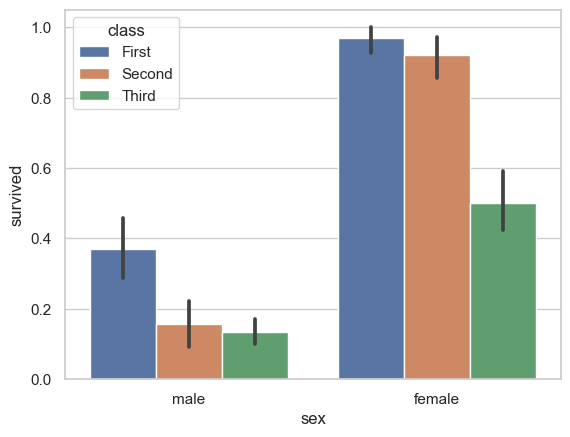
显示值的集中趋势可以用条形图
sns.barplot(x='sex',y='survived',hue="class",data=titanic)
<Axes: xlabel='sex', ylabel='survived'>
点图可以更好的描述变化差异
sns.pointplot(x='sex',y='survived',hue="class",data=titanic)
<Axes: xlabel='sex', ylabel='survived'>

sns.pointplot(x='class',y='survived',hue="sex",data=titanic,
              palette={"male":"g","female":"r"},
             markers=["^","o"],linestyles=["-",'--'])
<Axes: xlabel='class', ylabel='survived'>

这段代码使用 Seaborn 库的 pointplot 函数绘制了根据 "class" 分组的 "survived" 数据的点图,并根据性别 "sex" 进行着色区分,同时定义了不同性别的标记和线型样式。
具体解释如下:
sns.pointplot(x='class', y='survived', hue="sex", data=titanic, palette={"male": "g", "female": "r"}, markers=["^", "o"], linestyles=["-", "--"]):调用 Seaborn 库的pointplot函数绘制点图。- 参数
x指定 x 轴数据,这里是 "class"(船舱等级)。 - 参数
y指定 y 轴数据,这里是 "survived"(生存情况)。 - 参数
hue指定着色的依据,这里是 "sex"(性别)。 - 参数
data是所使用的数据集,这里是 "titanic" 数据集。 - 参数
palette设置不同性别的颜色,"male" 对应绿色,"female" 对应红色。 - 参数
markers设置不同性别的标记样式,"^" 表示男性用三角形标记,"o" 表示女性用圆圈标记。 - 参数
linestyles设置不同性别的线型样式,"-" 表示男性实线,"--" 表示女性虚线。
- 参数
这段代码绘制了根据船舱等级 "class" 分组的生存情况 "survived" 数据的点图,并根据性别 "sex" 进行了着色、标记和线型样式区分。
宽形数据
sns.boxplot(data=iris,orient='h')
<Axes: >
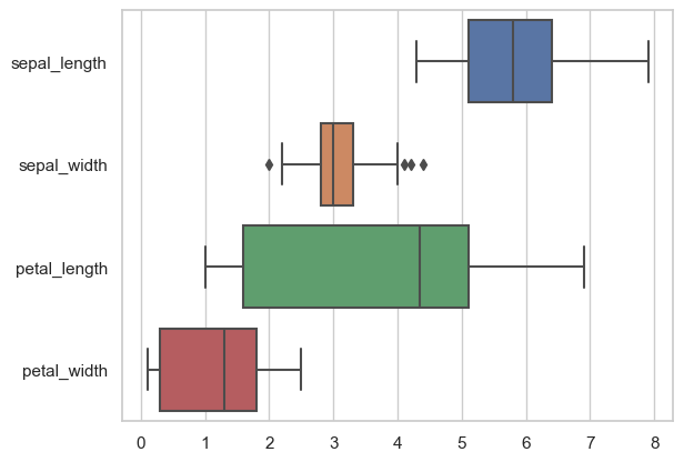
这段代码使用 Seaborn 库的 boxplot 函数绘制了横向箱线图(Horizontal Box Plot)。
具体解释如下:
sns.boxplot(data=iris, orient='h'):调用 Seaborn 库的boxplot函数绘制箱线图。- 参数
data是所使用的数据集,这里是 "iris" 数据集。 - 参数
orient='h'表示绘制横向箱线图。
- 参数
这段代码绘制了 "iris" 数据集中各个数值特征的横向箱线图,用于展示数据的分布情况、异常值等统计信息。
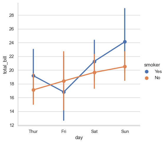
多层面板分类图
sns.catplot(x='day', y='total_bill', hue='smoker', data=tips, kind='point')
<seaborn.axisgrid.FacetGrid at 0x19dca552050>
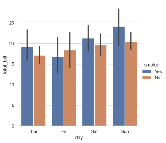
sns.catplot(x='day', y='total_bill', hue='smoker', data=tips, kind='bar')
<seaborn.axisgrid.FacetGrid at 0x19dc9323340>
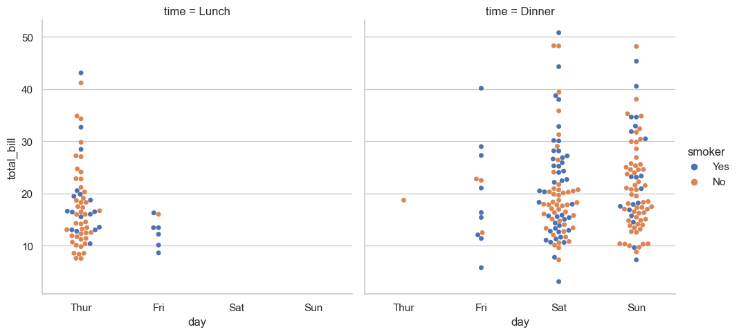
sns.catplot(x='day', y='total_bill', hue='smoker', data=tips, kind='swarm',col='time')
<seaborn.axisgrid.FacetGrid at 0x19dcb1d7e50>
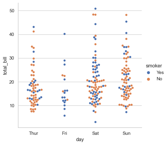
sns.catplot(x='day', y='total_bill', hue='smoker', data=tips, kind='swarm')
<seaborn.axisgrid.FacetGrid at 0x19dca7d7a60>
sns.catplot(x='time', y='total_bill', hue='smoker', data=tips, kind='box',col='day',aspect=1,height=5)
<seaborn.axisgrid.FacetGrid at 0x19d8a8fd2a0>
