一、选题背景
近几年,“数据”这个词语越来越火爆。从整个环境来讲,企业愈发关注数据所带来的巨大价值,并将数据业务逐渐渗透到企业的发展版图中。也正是因为企业对数据方向的逐步重视,数据相关岗位的需求增多,近几年呈爆发式增长。
对于现在的人才需求市场,数据类岗位尤以数据分析师最为突出。数据分析现已作为一门学科加入到高等院校的课程体系中,成为炙手可热的一个方向。
二、大数据分析设计方案
1、本数据集的数据内容与数据特征分析
本案例数据基于工作者得年龄、工作类别、学历、婚姻状况、性别、每周工作时间、所在国家、种族、所在州、所在城市、家庭情况来分析工作者的薪资水平。
| 字段名称 | 字段类型 | 字段说明 |
|---|---|---|
|
Age |
数值型 | 年龄 |
|
workclass |
字符型 | 工作类 |
|
education |
字符型 | 学历 |
|
marital-status |
字符型 | 婚姻状况 |
|
sex |
字符型 | 性别 |
|
hours-per-week |
数值型 | 每周工作时间 |
|
salary |
数值型 | 薪水 |
| COUNTRY | 字符型 | 所在的国家 |
| CITY | 字符型 | 所在城市 |
| STATE | 字符型 | 所在州 |
| race | 字符型 | 种族 |
|
relationship |
字符型 | 家庭情况 |
2、数据分析的课程设计方案概述
(1)先对数据集的数据进行所需要的处理,并计算数据集中各种数据与薪资水平的相关性。
(2)对数据集每一种数据与薪资的关系进行python可视化处理,从而得到更加直观的数据信息。
三、数据分析步骤
1.数据源
该数据集来自kaggle
网址:https://www.kaggle.com/datasets/iamsouravbanerjee/analytics-industry-salaries-2022-india
2.数据清洗
导入数据
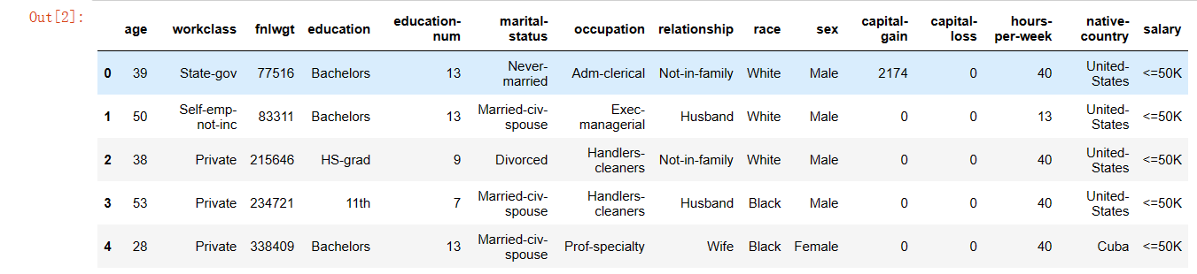
1 df = pd.read_csv('./salary.csv')
2 df.head()
显示结果
查看数据行数和列数
1 df.shape
显示结果

统计重复值
1 df.duplicated().sum()
显示结果

删除重复值
1 #删除重复值
2 df.drop_duplicates(keep = 'first' , inplace=True)
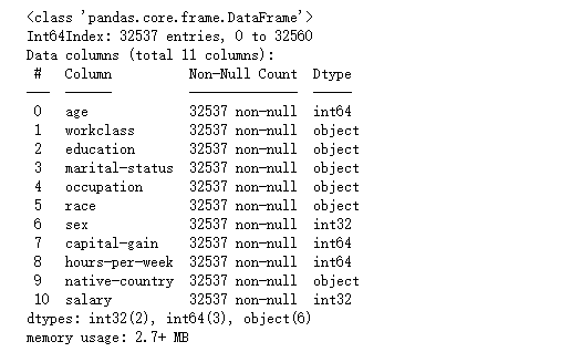
查看数据信
1 df.info()
显示结果

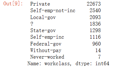
工作类统计
1 df.drop(columns = ['fnlwgt' , 'education-num' , 'relationship' , 'capital-loss'] , inplace = True)
2 df['workclass'].value_counts()
显示结果
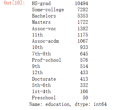
学历统计
1 df['education'].value_counts()
显示结果
婚姻状况统计
1 df['marital-status'].value_counts()
显示结果

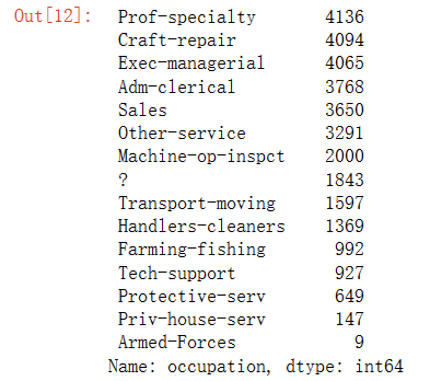
职业类型统计
1 df['occupation'].value_counts()
显示结果
所在地区的统计
1 df['native-country'].value_counts()
显示结果

人种的统计
1 df['race'].value_counts()
显示结果

数据清理
- 合并变量1st-4th,5th-6th,7th-8th,10th,11th,12th,“学龄前”作为工人阶级小学列
- 并将变量“Assoc voc”、“Assoc acdm”、“Prof school”、“Some college”合并为高中
- 合并军事状态“已婚公民配偶”、“已婚AF配偶”、已婚并保持为其他人
- 更改“?”为本列的众数
- 在国家栏中,大多数值是美国的,因此将其他值视为一个
- 考虑白人和种族栏中的其他人
- 数据包含大量私人工人阶级的信息,因此我们将考虑保留为其他人
- 将薪资和性别列隐藏为1和0(这也是模型预测的需要)
-
1 #第一步
2 df['education'].replace(['Preschool', '1st-4th', '5th-6th', '7th-8th', '9th','10th', '11th', '12th'], 'school' ,inplace = True , regex = True)
3 df['education'].replace(['Assoc-voc', 'Assoc-acdm', 'Prof-school', 'Some-college'], 'higher' , inplace = True , regex = True)
1 #第二步
2 df['marital-status'].replace(['Married-civ-spouse', 'Married-AF-spouse'], 'married' , inplace=True , regex = True)
3 df['marital-status'].replace(['Divorced', 'Separated','Widowed', 'Married-spouse-absent' , 'Never-married'] , 'other' , inplace=True , regex = True)
1 #第三步
2 df['workclass'] = df['workclass'].str.replace('?', 'Private' )
3 df['occupation'] = df['occupation'].str.replace('?', 'Prof-specialty' )
4 df['native-country'] = df['native-country'].str.replace('?', 'United-States' )
1 #第四步
2 for i in df['native-country'] :
3     if i != ' United-States':
4         df['native-country'].replace([i] , 'Others' , inplace = True)
1 #第五步
2 for i in df['race'] :
3     if i != ' White':
4         df['race'].replace([i] , 'Others' , inplace = True)
1 #第六步
2 for i in df['workclass'] :
3     if i != ' Private':
4         df['workclass'].replace([i] , 'Others' , inplace = True)
1 #第七步
2 from sklearn.preprocessing import LabelEncoder
3 encoder = LabelEncoder()
4 df['salary'] = encoder.fit_transform(df['salary'])
5 df['sex'] = encoder.fit_transform(df['sex'])
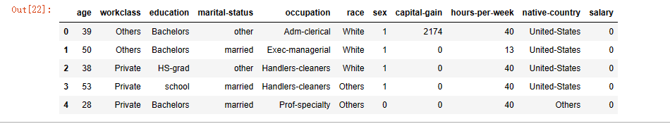
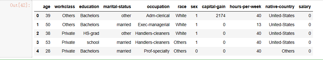
读取数据
1 df.head()
显示结果
3、数据可视化
绘制数据图
1 import matplotlib.pyplot as plt
2 import seaborn as sns
1 df.info()
显示结果
绘制薪资大于50k和小于50k的比例图
1 plt.pie(df['salary'].value_counts() , labels = ['0' ,'1'] , autopct = '%0.2f')
2 plt.show()
显示结果

从图中可以看出接近76%的工作者薪资少于50k,只有24%左右的工作者薪资高于50k
绘制工作者的地区分布图
1 plt.pie(df['native-country'].value_counts() , labels = ['US' ,'Others'] , autopct = '%0.2f')
2 plt.show()
显示结果
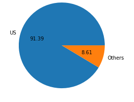
从图中方可以看出数据中大部分薪资高的工作者来自美国
绘制婚姻状况的饼状图
1 plt.pie(df['marital-status'].value_counts() , labels = ['Married' ,'Others'] , autopct = '%0.2f')
2 plt.show()
显示结果

从图中可以看出本数据中高薪资已婚与未婚人数基本上是一样多的
年龄与薪资的关系图
1 sns.histplot(df[df['salary'] ==0]['age'])
2 sns.histplot(df[df['salary'] ==1]['age'] , color='red')
显示结果
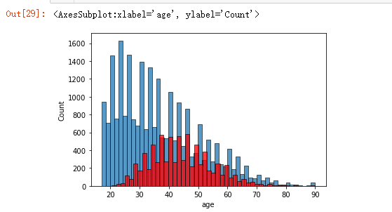
从图中可以直观的看出在38至48岁的年龄段,有更多的人的工资高于50k
学历与薪资的关系图
1 sns.histplot(df[df['salary'] ==0]['education'])
2 sns.histplot(df[df['salary'] ==1]['education'] , color='red')
显示结果
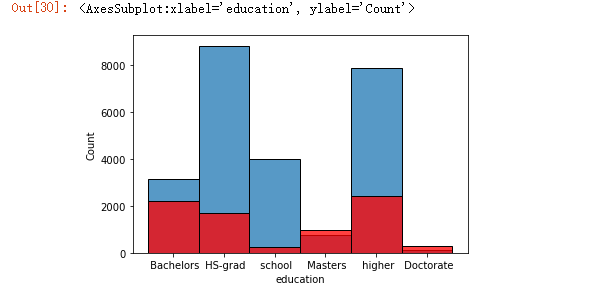
从图中可以看出受教育的程度越高薪资也越高,选取的数据中博士学历的薪资都超过了50k
职业与薪资水平的关系图
1 sns.histplot(df[df['salary'] ==0]['occupation'])
2 sns.histplot(df[df['salary'] ==1]['occupation'] , color='red')
3 plt.xticks(rotation='vertical')
4 plt.show()
显示结果
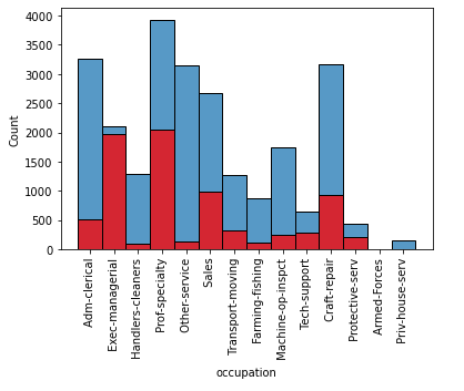
关系其实不是很明显但是Exec-managerial这个职业分厂的突出有更高比例是高薪,其次是prof-specialty
数据中薪资超过50k的人种统计
1 plt.pie(df['race'].value_counts(), labels=['white' , 'others'] , autopct = '%0.2f')
2 plt.show()
显示结果

从图中可以看出绝大多数来自于白人,有一定局限性,因为不同人种的职业分布是不一样的
一周工作时间与薪资的关系
1 sns.distplot(df[df['salary'] ==0]['hours-per-week'])
2 sns.distplot(df[df['salary'] ==1]['hours-per-week'] , color='red')
3 plt.xticks(rotation='vertical')
4 plt.show()
显示结果

从图中可以看出一周的工作时间与薪水的关系非常微妙,并不是工作时间越长薪水越多,一周工作40-60小时的员工,可能薪水更高
薪资与年龄、性别、工作时间的关系
1 df_heat = df[df['capital-gain'] <6000
显示结果
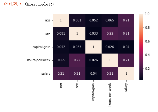
从图中可以看出年龄、性别、工作时间对薪资都有影响
4、大数据分析过程及采用的算法
1 df.head()
显示结果
标准化,防止量纲的影响
1 from sklearn.preprocessing import StandardScaler
2 y = df['salary']
3 df.drop('salary' ,axis = 1 , inplace=True)
4 num_cols = [x for x in df.columns if df[x].dtype != 'object']
5 Scaler = StandardScaler()
6 df[num_cols] = Scaler.fit_transform(df[num_cols])
转化为onehot变量,消除字符类型数据影响而且保证一定程度的变量取值的不干涉
1 df['native-country'] =df['native-country'].apply(lambda x : x.strip())
2 cat_col = [x for x in df.columns if df[x].dtype == 'object']
3 df=pd.get_dummies(df , columns=cat_col , drop_first=True)
1 from sklearn.model_selection import train_test_split
2 X_train, X_test, y_train, y_test = train_test_split(df , y , test_size=0.2 ,shuffle=True, random_state=41)
3 print('Shape of training feature:', X_train.shape)
4 print('Shape of testing feature:', X_test.shape)
5 print('Shape of training label:', y_train.shape)
6 print('Shape of training label:', y_test.shape)
显示结果

导入不同的机器学习模型,使用原有参数进行训练
 1 from sklearn.ensemble import RandomForestClassifier, AdaBoostClassifier,GradientBoostingClassifier, ExtraTreesClassifier, VotingClassifier
 2 from sklearn.discriminant_analysis import LinearDiscriminantAnalysis
 3 from sklearn.linear_model import LogisticRegression
 4 from sklearn.neighbors import KNeighborsClassifier
 5 from sklearn.tree import DecisionTreeClassifier
 6 from sklearn.neural_network import MLPClassifier
 7 from sklearn.neighbors import KNeighborsClassifier
 8 from sklearn.svm import SVC
 9 from sklearn.model_selection import GridSearchCV, cross_val_score,StratifiedKFold, learning_curve
10 import warnings
11 warnings.filterwarnings('ignore')
12 from sklearn.metrics import accuracy_score, confusion_matrix, classification_report
13 from sklearn.model_selection import cross_val_predict
显示结果

4.附上完整代码
  1 import numpy as np
  2 import pandas as pd
  3 #数据清洗
  4 df = pd.read_csv('./salary.csv')
  5 df.head()
  6 #查看数据行数和列数
  7 df.shape
  8 #检查数据是否有空值
  9 df.isnull().sum()
 10 #统计重复值
 11 df.duplicated().sum()
 12
 13 #删除重复值
 14 df.drop_duplicates(keep = 'first' , inplace=True)
 15 #查看数据信息
 16 df.info()
 17
 18 df.drop(columns = ['fnlwgt' , 'education-num' , 'relationship' , 'capital-loss'] , inplace = True)
 19 #工作类统计
 20 df['workclass'].value_counts()
 21 #学历统计
 22 df['education'].value_counts()
 23 # 婚姻状况统计
 24 df['marital-status'].value_counts()
 25 #职业类型统计
 26 df['occupation'].value_counts()
 27 # 所在地区的统计
 28 df['native-country'].value_counts()
 29 #人种统计
 30 df['race'].value_counts()
 31
 32 #第一步
 33 df['education'].replace(['Preschool', '1st-4th', '5th-6th', '7th-8th', '9th','10th', '11th', '12th'], 'school' ,inplace = True , regex = True)
 34 df['education'].replace(['Assoc-voc', 'Assoc-acdm', 'Prof-school', 'Some-college'], 'higher' , inplace = True , regex = True)
 35
 36 #第二步
 37 df['marital-status'].replace(['Married-civ-spouse', 'Married-AF-spouse'], 'married' , inplace=True , regex = True)
 38 df['marital-status'].replace(['Divorced', 'Separated','Widowed', 'Married-spouse-absent' , 'Never-married'] , 'other' , inplace=True , regex = True)
 39
 40 #第三步
 41 df['workclass'] = df['workclass'].str.replace('?', 'Private' )
 42 df['occupation'] = df['occupation'].str.replace('?', 'Prof-specialty' )
 43 df['native-country'] = df['native-country'].str.replace('?', 'United-States' )
 44
 45 #第四步
 46 for i in df['native-country'] :
 47     if i != ' United-States':
 48         df['native-country'].replace([i] , 'Others' , inplace = True)
 49
 50         #第五步
 51 for i in df['race'] :
 52     if i != ' White':
 53         df['race'].replace([i] , 'Others' , inplace = True)
 54
 55         #第六步
 56 for i in df['workclass'] :
 57     if i != ' Private':
 58         df['workclass'].replace([i] , 'Others' , inplace = True)
 59
 60         #第七步
 61 from sklearn.preprocessing import LabelEncoder
 62 encoder = LabelEncoder()
 63 df['salary'] = encoder.fit_transform(df['salary'])
 64 df['sex'] = encoder.fit_transform(df['sex'])
 65
 66 df.head()
 67
 68 #数据可视化分析
 69 import matplotlib.pyplot as plt
 70 import seaborn as sns
 71
 72 df.info()
 73
 74 #薪资水平分析
 75 plt.pie(df['salary'].value_counts() , labels = ['0' ,'1'] , autopct = '%0.2f')
 76 plt.show()
 77
 78 #所在的地区
 79 plt.pie(df['native-country'].value_counts() , labels = ['US' ,'Others'] , autopct = '%0.2f')
 80 plt.show()
 81
 82 #婚姻状况分析
 83 plt.pie(df['marital-status'].value_counts() , labels = ['Married' ,'Others'] , autopct = '%0.2f')
 84 plt.show()
 85 sns.histplot(df[df['salary'] ==0]['marital-status'])
 86 sns.histplot(df[df['salary'] ==1]['marital-status'] , color='red')
 87
 88 #年龄因素分析
 89 sns.histplot(df[df['salary'] ==0]['age'])
 90 sns.histplot(df[df['salary'] ==1]['age'] , color='red')
 91
 92 #受教育的程度分析
 93 sns.histplot(df[df['salary'] ==0]['education'])
 94 sns.histplot(df[df['salary'] ==1]['education'] , color='red')
 95
 96 #工作职业与薪资的关系
 97 sns.histplot(df[df['salary'] ==0]['occupation'])
 98 sns.histplot(df[df['salary'] ==1]['occupation'] , color='red')
 99 plt.xticks(rotation='vertical')
100 plt.show()
101 #人种与薪资的分析
102 plt.pie(df['race'].value_counts(), labels=['white' , 'others'] , autopct = '%0.2f')
103 plt.show()
104
105 df['workclass'].unique()
106 #工作类型
107 plt.pie(df['workclass'].value_counts() , labels=['private' , 'others'] , autopct ='%0.2f')
108 plt.show()
109
110 #一周工作时间与薪资水平的关系
111 sns.distplot(df[df['salary'] ==0]['hours-per-week'])
112 sns.distplot(df[df['salary'] ==1]['hours-per-week'] , color='red')
113 plt.xticks(rotation='vertical')
114 plt.show()
115
116 sns.distplot(df[df['salary'] ==0]['capital-gain'])
117 sns.distplot(df[df['salary'] ==1]['capital-gain'] , color='red')
118 plt.xticks(rotation='vertical')
119 plt.show()
120
121 df_heat = df[df['capital-gain'] <6000 ]
122 sns.heatmap(df_heat.corr() , annot=True)
123
124 #薪资与年龄、性别、工作时间的综合分析
125 fig,ax = plt.subplots(1,2, figsize=(15,5))
126 sns.distplot(df["age"], kde=True, ax=ax[0])
127 sns.boxplot(df["age"], ax=ax[1])
128
129 #异常值检测
130 outliers = []
131 q1 = df["age"].quantile(0.25)
132 q3 = df["age"].quantile(0.75)
133 iqr = q3-q1
134
135 lower_bound = q1-1.5*iqr
136 upper_bound = q3+1.5*iqr
137
138 for value in df["age"]:
139     if value > upper_bound or value < lower_bound or value <=0:
140         outliers.append(value)
141
142 print("{} has {} outliers".format("age", len(outliers)))
143
144 #用合理值替换
145 mn = int(df["age"].median())
146
147 for value in df["age"]:
148     if value > upper_bound or value < lower_bound:
149         df["age"] = df["age"].replace(value, mn) #(replace(current_value, new_value))
150
151         from sklearn.preprocessing import StandardScaler
152 y = df['salary']
153 df.drop('salary' ,axis = 1 , inplace=True)
154 num_cols = [x for x in df.columns if df[x].dtype != 'object']
155 Scaler = StandardScaler()
156 df[num_cols] = Scaler.fit_transform(df[num_cols])
157
158 df['native-country'] =df['native-country'].apply(lambda x : x.strip())
159 cat_col = [x for x in df.columns if df[x].dtype == 'object']
160 df=pd.get_dummies(df , columns=cat_col , drop_first=True)
161
162 from sklearn.model_selection import train_test_split
163 X_train, X_test, y_train, y_test = train_test_split(df , y , test_size=0.2 ,shuffle=True, random_state=41)
164
165 print('Shape of training feature:', X_train.shape)
166 print('Shape of testing feature:', X_test.shape)
167 print('Shape of training label:', y_train.shape)
168 print('Shape of training label:', y_test.shape)
169
170 #导入不同的机器学习模型
171 from sklearn.ensemble import RandomForestClassifier, AdaBoostClassifier,GradientBoostingClassifier, ExtraTreesClassifier, VotingClassifier
172 from sklearn.discriminant_analysis import LinearDiscriminantAnalysis
173 from sklearn.linear_model import LogisticRegression
174 from sklearn.neighbors import KNeighborsClassifier
175 from sklearn.tree import DecisionTreeClassifier
176 from sklearn.neural_network import MLPClassifier
177 from sklearn.neighbors import KNeighborsClassifier
178 from sklearn.svm import SVC
179 from sklearn.model_selection import GridSearchCV, cross_val_score,StratifiedKFold, learning_curve
180 import warnings
181 warnings.filterwarnings('ignore')
182 from sklearn.metrics import accuracy_score, confusion_matrix, classification_report
183 from sklearn.model_selection import cross_val_predict
184
185 df
186
187 random_state = 2
188 classifiers = []
189 classifiers.append(SVC(random_state=random_state))
190 classifiers.append(DecisionTreeClassifier(random_state=random_state))
191 classifiers.append(AdaBoostClassifier(DecisionTreeClassifier(random_state=random_state),random_state=random_state))
192 classifiers.append(RandomForestClassifier(random_state=random_state))
193 classifiers.append(ExtraTreesClassifier(random_state=random_state))
194 classifiers.append(GradientBoostingClassifier(random_state=random_state))
195 classifiers.append(LogisticRegression(random_state = random_state))
196
197 cv_results = []
198 for classifier in classifiers :
199     cv_results.append(cross_val_score(classifier,X_train, y_train, scoring = "accuracy", cv =5, n_jobs=4))
200 cv_means = []
201 cv_std = []
202 for cv_result in cv_results:
203     cv_means.append(cv_result.mean())
204     cv_std.append(cv_result.std())
205 cv_res = pd.DataFrame({"CrossValMeans":cv_means,"CrossValerrors":cv_std,"Algorithm":["SVC","DecisionTree","AdaBoost",
206 "RandomForest","ExtraTrees","GradientBoosting","Logist"]})
207 g = sns.barplot("CrossValMeans","Algorithm",data = cv_res,palette="Set3",orient = "h",**{'xerr':cv_std})
208 g.set_xlabel("Mean Accuracy")
209 g = g.set_title("Cross validation scores")
210
211 #对GBDT、SVC、逻辑回归、随机森林进行微调
212 GBC = GradientBoostingClassifier()
213 gb_param_grid = {'loss' : ["deviance"],
214                 'n_estimators' : [100,200,300],
215                 'learning_rate': [0.1, 0.05, 0.01],
216                 'max_depth': [4, 8],
217                 'min_samples_leaf': [100,150],
218                 'max_features': [0.3, 0.1]
219 }
220 gsGBC = GridSearchCV(GBC,param_grid = gb_param_grid, cv=5,scoring="accuracy", n_jobs= 4, verbose = 1)
221 gsGBC.fit(X_train, y_train)
222 GBC_best = gsGBC.best_estimator_
223 gsGBC.best_score_
224
225 svc = SVC()
226 svc_param_grid = {'gamma': [1e-3, 1e-4], 'C': [1, 10, 100, 1000]},
227 gsmvc=GridSearchCV(svc,param_grid=svc_param_grid,cv=5,scoring="accuracy", n_jobs= 4, verbose = 1)
228 gsmvc.fit(X_train, y_train)
229 mvc_best=gsmvc.best_estimator_
230 gsmvc.best_score_
231
232 RFC = RandomForestClassifier()
233 rf_param_grid = {"max_depth": [None],
234     "max_features": [1, 3, 10],
235     "min_samples_split": [2, 3, 10],
236     "min_samples_leaf": [1, 3, 10],
237     "bootstrap": [False],
238     "n_estimators" :[100,300],
239     "criterion": ["gini"]}
240 gsRFC = GridSearchCV(RFC,param_grid = rf_param_grid, cv=5,scoring="accuracy", n_jobs= 4, verbose = 1)
241 gsRFC.fit(X_train , y_train)
242 RFC_best = gsRFC.best_estimator_
243 gsRFC.best_score_
244
245 logC = LogisticRegression()
246 log_param_grid={'penalty':['l2','l1'] ,
247                 'dual':[True , False],
248                 'C':[0.01 , 0.1 , 1 , 1, 10 ]}
249 gslogC = GridSearchCV(logC,param_grid = log_param_grid, cv=5,scoring="accuracy", n_jobs= 4, verbose = 1)
250 gslogC.fit(X_train, y_train)
251 logC_best = gslogC.best_estimator_
252 gslogC.best_score_
253
254 def evaluate_model(model, x_test, y_test):
255     from sklearn import metrics
256
257     # Predict Test Data
258     y_pred = model.predict(x_test)
259
260     # Calculate accuracy, precision, recall, f1-score, and kappa score
261     acc = metrics.accuracy_score(y_test, y_pred)
262     prec = metrics.precision_score(y_test, y_pred)
263     rec = metrics.recall_score(y_test, y_pred)
264     f1 = metrics.f1_score(y_test, y_pred)
265
266     # Display confussion matrix
267     cm = metrics.confusion_matrix(y_test, y_pred)
268
269     return {'acc': acc, 'prec': prec, 'rec': rec, 'f1': f1,'cm': cm}
270
271 GBC_eval =  evaluate_model(GBC_best, X_test, y_test)
272 print('Accuracy:', GBC_eval['acc'])
273 print('Precision:', GBC_eval['prec'])
274 print('Recall:', GBC_eval['rec'])
275 print('F1 Score:', GBC_eval['f1'])
276 print('Confusion Matrix:\n', GBC_eval['cm'])
277
278 logC_best_eval =  evaluate_model(logC_best, X_test, y_test)
279 print('Accuracy:', logC_best_eval['acc'])
280 print('Precision:', logC_best_eval['prec'])
281 print('Recall:', logC_best_eval['rec'])
282 print('F1 Score:', logC_best_eval['f1'])
283 print('Confusion Matrix:\n', logC_best_eval['cm'])
284
285 mvc_best_eval =  evaluate_model(mvc_best, X_test, y_test)
286 print('Accuracy:', mvc_best_eval['acc'])
287 print('Precision:', mvc_best_eval['prec'])
288 print('Recall:', mvc_best_eval['rec'])
289 print('F1 Score:', mvc_best_eval['f1'])
290 print('Confusion Matrix:\n', mvc_best_eval['cm'])
291
292 RFC_best_eval =  evaluate_model(RFC_best, X_test, y_test)
293 print('Accuracy:', RFC_best_eval['acc'])
294 print('Precision:', RFC_best_eval['prec'])
295 print('Recall:', RFC_best_eval['rec'])
296 print('F1 Score:', RFC_best_eval['f1'])
297 print('Confusion Matrix:\n', RFC_best_eval['cm'])
298
299 def plot_learning_curve(models , X , y):
300         for model in models :
301             train_sizes , train_scores , test_scores =learning_curve(model ,X , y , n_jobs=-1 )
302             train_scores_mean = np.mean(train_scores ,axis = 1)
303             test_scores_mean = np.mean(test_scores ,axis=1)
304             plt.plot(train_sizes , train_scores_mean , 'o-' , color ='r' , label = 'Training score')
305             plt.plot(train_sizes , test_scores_mean , 'o-' , color ='g' , label = 'Cross-validation score')
306             plt.xlabel('Training set size')
307             plt.ylabel('Accuracy')
308             plt.legend()
309             plt.title(model)
310             plt.show()
311 plot_learning_curve(chosen_classifiers , X_train , y_train)
四、总结
1.通过对数据的分析和挖掘,达到了我们预期的目标,可以看出薪资水平与学历、年龄、职业、性别、工作时间、所在地区有很大的关系。从数据中可以直观看出学历越高的相对薪资水平也就越高。从周工作时间的数据分析来看,并不是工作时间越长工资越高,一周工作40-60小时的员工,可能薪水更高。
2.整体实验我们采用数据预处理-数据可视化-模型选择与调参三步进行,模型调参我们首先选择了模型参数比较优的模型,因为这些模型在调参后更有可能达到更高的分数,我们使用网格搜索对其进行调参。结果我们发现很多学习器基本上都出现了比较严重的过拟合的现象训练分数和交叉验证分数巨大的gap中可以看出来,最明显的是随机森林,其次是GBDT。另外从准确率分数来看,几个学习器都非常的优秀,但是如果落实到recall和F1-score上,每个模型还有很大的提升空间,这很有可能跟数据量以及数据集本身的不平衡有关系,需要更大的数据来佐证这一观点。