以上一个品优购为例加上相应细节:文字阴影,圆角和盒子阴影
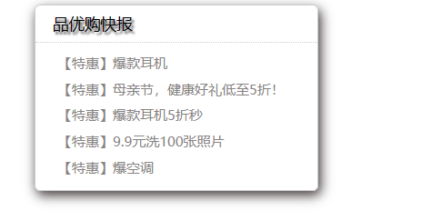
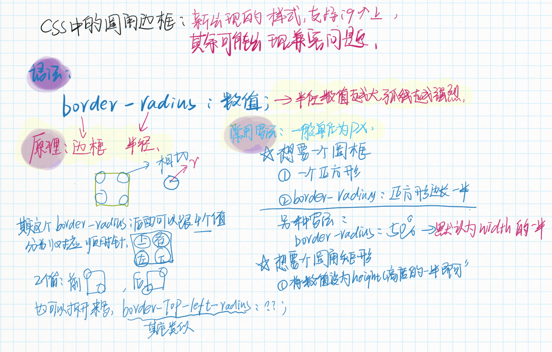
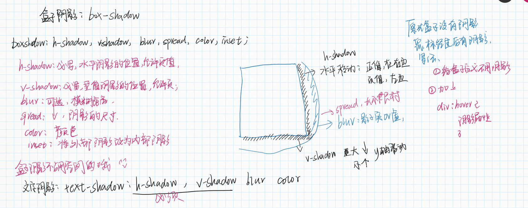
<!DOCTYPE html>
<html lang="en">
<head>
    <meta charset="UTF-8">
    <meta name="viewport" content="width=device-width, initial-scale=1.0">
    <title>Document</title>
    <style>
        * {
            margin: 0;
            padding: 0;

        }
        .nav {
            width: 248px;
            height: 163px;
            border: 1px solid #ccc;
            margin: 50px auto;
            /*下面将盒子变成圆角并加上阴影*/
            border-radius: 5px;
            box-shadow: 2px 4px 10px 0 rgb(71, 62, 62);/*向x轴移动的距离,向y轴移动的距离,(前两个必须写)阴影的虚实范围,阴影的范围,阴影的颜色*/
        }
      .nav h3 {
          font-weight: 400;/*去除加粗*/
            /*下面给文字加上阴影*/

            text-shadow:2px 2px 2px  rgb(73, 67, 67);
          font-size: 14px;
          height: 32px;
          line-height: 32px;
          padding-left: 15px;/**这里不能用margin-left原因是,margin-lrft是用于整个外边框的针对于整个h3的会导致虚线右移*/
          /*并且这里没有写宽度所以不会撑开盒子而且我们规定的是左右定义height不影响*/
          border-bottom:1px dotted #ccc ;

      }
      li {
           list-style: none;/*去掉li标签前面的小圆点*/
      }
      .nav ul li a {
          font-size: 12px;
          color: #888484;
          text-decoration: none;/*取出下划线*/

      }
      .nav ul li a:hover {
          color: black;
          text-decoration: underline;
      }
      .nav ul {
          margin-top:5px ;
      }
      .nav ul li {
          line-height: 23px;
          height: 23px;
          padding-left: 20px;

      }
    </style>
</head>
<body>
    <div class="nav">
     <h3>品优购快报</h3>
     <ul>
        <li><a href="#">【特惠】爆款耳机</a></li>
        <li><a href="#">【特惠】母亲节,健康好礼低至5折!</a></li>
        <li><a href="#">【特惠】爆款耳机5折秒</a></li>
        <li><a href="#">【特惠】9.9元洗100张照片</a></li>
        <li><a href="#">【特惠】爆空调</a></li>
     </ul>
    </div>
</body>
</html>