如何使用TypeScript和Styled-Components构建图像轮播组件

发布时间 2023-06-06 09:35:19作者: 晓风晓浪

近年来,OTT(over-the-top)视频流媒体平台变得更加创新和易于使用。在他们的用户界面中,电影和连续剧的标题排列得清晰可见。

在本教程中,我将指导您完成创建图像轮播组件的过程,该组件看起来就像您在许多 OTT 平台(想想 Netflix)上看到的一样。

我们将从创建原子组件开始,例如TagsDescriptionTitle等,它们将显示有关每个电影标题的各种信息。然后,我们将通过复合模式将这些组件拼接在一起,以创建一个Banner以图像形式显示每个电影标题的组件。最后,我们将使用该HeroBanner组件使用包构建图像轮播组件Swiper

(更多优质教程:java567.com,搜"ts")

到本文结束时,您将掌握创建美观且实用的图像轮播组件的知识和技能,这将给您的用户留下深刻印象。让我们开始吧!

图片97

目录

  • 先决条件

  • 如何构建横幅组件

  • 如何构建单个组件

  • 如何使用复合图案将所有组件缝合在一起

  • 如何构建图像轮播组件

  • 概括

先决条件

在继续下一节之前,请确保您熟悉以下主题:

  • CSS – 需要 CSS 的中级知识来设置我们将在本文中创建的小组件的样式。

  • Styled components——你需要熟悉 styled-components 是什么,因为我们将使用它来创建一个包含静态/动态 css 的组件版本。

  • 复合 模式——我们将使用此模式将各个组件拼接在一起,以便以后可以方便地使用它们。

  • TypeScript – 我们将在整个教程中使用TypeScript 。它在 JavaScript 之上提供了良好的类型安全。对它有一些基本的了解肯定会在这里有所收获。

如何构建横幅组件

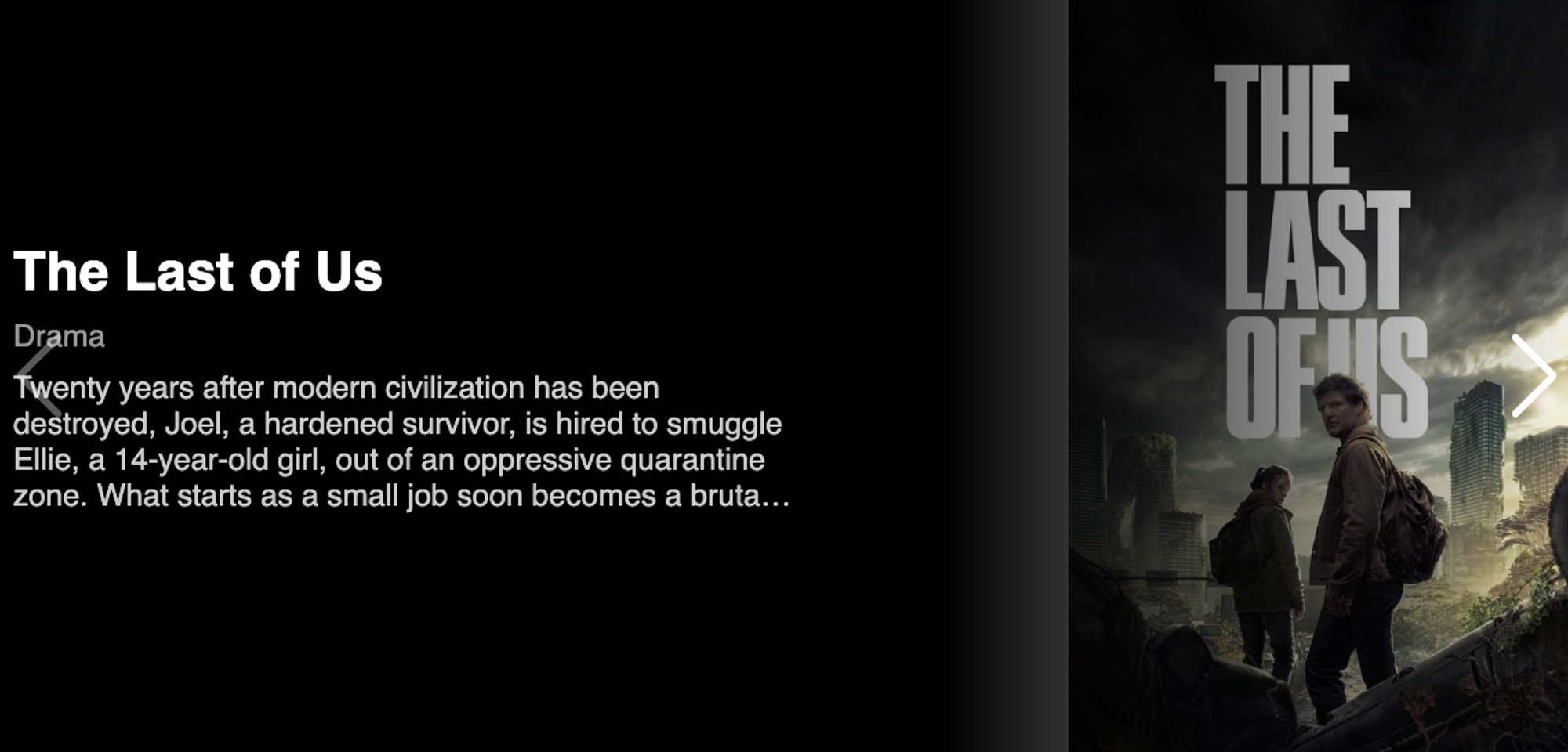
下面的 gif 表示图像轮播组件。如果您不知道什么是图像轮播,那么让我给您做一个简要的概述。

图片98

图像轮播是一个组件,由旋转固定次数或可以在导航图标的帮助下旋转的图像组成。

在本教程中,我们将创建此组件。但在进入图像轮播之前,我们将从一个非常基本的组件开始,即横幅组件。

Banner Component 将成为一个帮助我们显示的组件:

  • 标题

  • 标签

  • 描述

  • 背景图

之后,在styled-components和 CSS的帮助下,我们会让它看起来像我们在大多数 OTT 平台上看到的一样漂亮。

构建此组件涉及以下步骤:

  1. 构建各个组件

  2. 将所有组件与复合图案拼接在一起

如何构建单个组件

截图 2023-06-03-at-8.33.17-AM

我们的横幅组件将由一些无法进一步分解的基本较小组件组成。这些组件称为原子组件。让我们首先构建最简单的组件,即 Title 组件:

首先,创建一个如下所示的功能组件:

 const Title = (props: { title: string }) => <div>{props.title}</div>;

我们还需要设置此组件的样式。我们创建一个带样式的 div 组件并将其放置在上面的 Title 组件中,如下所示:

 const StyledTitle = styled.div`
   font-size: 28px;
   font-weight: 600;
   color: white;
 `;
 
 const Title = (props: { title: string }) => (
   <StyledTitle>{props.title}</StyledTitle>
 );

我们阵容中的下一个组件是Tags组件。它是一个 div 元素,它映射到字符串(标签)并将它们显示在元素中span

创建一个函数式组件,它接受一个字符串数组作为 prop,并使用 map 函数将它们显示在 span 元素中:

 const Tags = (props: { tags: string[] }) => {
   return (
     <div>
      {props.tags.map((tag: string, index: number) => (
         <span key={`tag-${tag}-index`}>{tag}</span>
      ))}
     </div>
  );
 };

现在让我们创建一个样式化的 div 组件,作为上述 div 元素的替代品。我们创建这个包装器组件来将样式应用于子元素:

 const StyledTag = styled.div`
   padding: 0.5rem 0;
 
   & span {
     margin-right: 0.5rem;
     font-size: 1rem;
     font-weight: 500;
     color: rgba(255, 255, 255, 0.6);
   }
 `;

最后,我们将这些组件拼接在一起:

 const Tags = (props: { tags: string[] }) => {
   return (
     <StyledTag>
      {tags.map((tag: string, index: number) => (
         <span key={`tag-${tag}-index`}>{tag}</span>
      ))}
     </StyledTag>
  );
 };

同样,我们创建另一个组件,称为Description组件。它有助于显示电影标题的描述。它也是一个功能组件,它接受描述道具并使用样式化组件显示它:

 const StyledDescription = styled.div`
   text-align: start;
   color: rgba(255, 255, 255, 0.8);
   display: -webkit-box;
   max-width: 50%;
   -webkit-line-clamp: 4;
   -webkit-box-orient: vertical;
   overflow: hidden;
 `;
 
 const Description = (props: { description: string }) => (
   <StyledDescription>{description}</StyledDescription>
 );

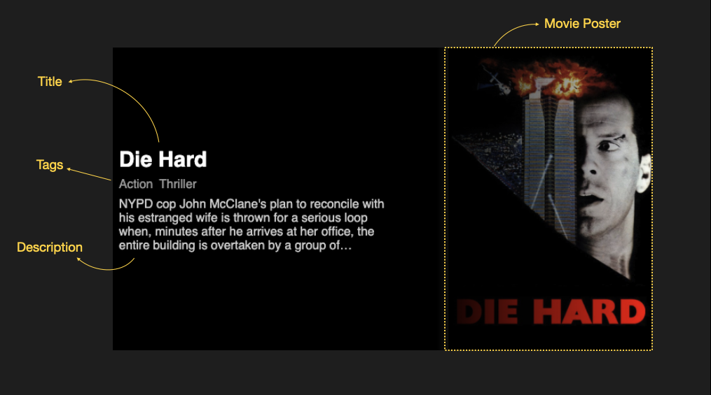
最后,我们将创建Banner组件。该组件的目的是显示电影标题的背景图像以及传递给它的子项。让我们创建这个组件的一个非常基本的版本:

 const Banner = (props) => {
   return (
     <div
       style={{
         backgroundImage: `url(${props.image})`,
         width: "100%",
         height: "400px",
      }}
     >
       <div>{props.children}</div>
     </div>
  );
 };
 
 <Banner image="https://m.media-amazon.com/images/M/MV5BZjRlNDUxZjAtOGQ4OC00OTNlLTgxNmQtYTBmMDgwZmNmNjkxXkEyXkFqcGdeQXVyNzkwMjQ5NzM@._V1_.jpg">
   <h1 style={{ color: "yellow" }}>Die hard</h1>
 </Banner>;

如果我们执行这个组件,它会做我们期望的事情,“显示背景图像和子组件”,如下所示:

图片-101

但是风格似乎不对——我们不希望这个组件看起来这么难看。我们需要的是应用 CSS 将事物放在正确的位置 ?(双关语)。

我们希望电影海报在右边,所有子组件都应该在它的左边。现在让我们创建一个样式化的组件来做到这一点:

 const StyledContainer = styled.div`
   height: 400px;
   width: 100%;
   display: flex;
   background-image: linear-gradient(90deg, rgba(0, 0, 0, 1) 60%, transparent),
     url(${(props) => props.image});
   background-size: contain;
   background-repeat: no-repeat;
   background-position: right;
 
   & > div {
     display: flex;
     flex-direction: column;
     justify-content: center;
     align-items: flex-start;
     padding-left: 10px;
   }
 `;
 
 const Banner = (props) => {
   return (
     <StyledContainer image={props.image}>
       <div>{props.children}</div>
     </StyledContainer>
  );
 };
 
 <Banner image="https://m.media-amazon.com/images/M/MV5BZjRlNDUxZjAtOGQ4OC00OTNlLTgxNmQtYTBmMDgwZmNmNjkxXkEyXkFqcGdeQXVyNzkwMjQ5NzM@._V1_.jpg">
   <h1 style={{ color: "yellow" }}>Die hard</h1>
 </Banner>;

我们创建了一个名为 的新样式组件StyledContainer。它由 CSS 组成,它将图像右对齐并在容器周围应用黑色渐变,以便只有电影标题可见。

接下来,在该& > div部分中,我们确保所有子组件都左对齐。这是它的样子:

图片-103

耶皮耶!我们的 Banner 组件已准备就绪。现在让我们用上面创建的所有组件测试这个横幅组件。将Title, Tags, 和Description组件放在Banner组件内部,如下所示:

 <Banner image="https://m.media-amazon.com/images/M/MV5BZjRlNDUxZjAtOGQ4OC00OTNlLTgxNmQtYTBmMDgwZmNmNjkxXkEyXkFqcGdeQXVyNzkwMjQ5NzM@._V1_.jpg">
   <Title title="Die Hard" />
   <Tags tags={["Action", "Thriller"]} />
   <Description description="NYPD cop John McClane's plan to reconcile with his estranged wife is thrown for a serious loop when, minutes after he arrives at her office, the entire building is overtaken by a group of terrorists. With little help from the LAPD, wisecracking McClane sets out to single-handedly rescue the hostages and bring the bad guys down." />
 </Banner>;

图片-104这就是我们的 Banner 组件的样子。

如何使用复合图案将所有组件缝合在一起

我们希望我们的 Banner 组件易于使用,并且应该灵活。我们可以借助复合模式将 Title、Tags 和 Description 组件拼接到 Banner 组件中。

使用此模式创建的组件在其内部组件之间共享状态和逻辑。这种复合模式的一个例子是语义 UI 提供的菜单组件。

 <Menu>
   <Menu.Item />
 </Menu>;

使用这种模式的好处是我们只需要导入一个组件——在我们的例子中我们只导入 Banner 组件。它的所有内部组件都可以直接使用,如下所示:

 <Banner.Title />
 <Banner.Tags />
 <Banner.Description />

现在让我们开始为我们的 Banner 组件做同样的事情。

由于我们已准备好所有组件,因此我将它们放在一个文件中:

 import "./styles.css";
 import styled from "styled-components";
 import React from "react";
 
 export type BannerProps = {
   title: string,
   tags: string[],
   description: string,
   image: string,
 };
 
 const StyledTitle = styled.div`
   font-size: 28px;
   font-weight: 600;
   color: white;
 `;
 
 const StyledTag = styled.div`
   padding: 0.5rem 0;
 
   & span {
     margin-right: 0.5rem;
     font-size: 1rem;
     font-weight: 500;
     color: rgba(255, 255, 255, 0.6);
   }
 `;
 
 const StyledDescription = styled.div`
   text-align: start;
   color: rgba(255, 255, 255, 0.8);
   display: -webkit-box;
   max-width: 50%;
   -webkit-line-clamp: 4;
   -webkit-box-orient: vertical;
   overflow: hidden;
 `;
 const Container = styled.div`
   height: 400px;
   width: 100%;
   display: flex;
   background-image: linear-gradient(90deg, rgba(0, 0, 0, 1) 60%, transparent),
     url(${(props: Pick<BannerProps, "image">) => props.image});
   background-size: contain;
   background-repeat: no-repeat;
   background-position: right;
 
   & > div {
     display: flex;
     flex-direction: column;
     justify-content: center;
     align-items: flex-start;
     padding-left: 10px;
   }
 `;
 
 const Title = ({ title }: Pick<BannerProps, "title">) => (
   <StyledTitle>{title}</StyledTitle>
 );
 
 const Tags = ({ tags }: Pick<BannerProps, "tags">) => {
   return (
     <StyledTag>
      {tags.map((tag) => (
         <span key={`tag-${tag}`}>{tag}</span>
      ))}
     </StyledTag>
  );
 };
 
 const Description = ({ description }: Pick<BannerProps, "description">) => (
   <StyledDescription>{description}</StyledDescription>
 );
 
 const Banner = (props: any) => {
   return (
     <Container image={props.image}>
       <div>{props.children}</div>
     </Container>
  );
 };
 
 Banner.Title = Title;
 Banner.Tags = Tags;
 Banner.Description = Description;
 
 export default Banner;

上面代码的快速解释:

首先,我们为名为 BannerProps 的横幅组件创建类型。它看起来像这样:

 export type BannerProps = {
   title: string;
   tags: string[];
   description: string;
   image: string;
 };

接下来,我们将创建的所有原子组件放在这里。我们还确保在原子组件的每个函数定义中使用 BannerProps 类型,例如:

 const Title = ({ title }: Pick<BannerProps, "title">) => (
   <StyledTitle>{title}</StyledTitle>
 );

如您所见,我们使用 TypeScript 的 Pick 实用程序函数仅从 Banner 道具中选取标题道具。

最后,我们通过为 Banner 组件创建一个新属性来拼接所有这些组件,如下所示,并导出该组件:

 Banner.Title = Title;
 Banner.Tags = Tags;
 Banner.Description = Description;
 
 export default Banner;

注意:出于本教程的目的,我们使用复合模式,但您可以独立使用这些原子组件。我这里选择使用复合模式来教大家使用。您可以将它应用于不同的场景,例如构建选择按钮或菜单组件时。

干得好——我们终于将所有的原子组件拼接成一个单一的 Banner 组件。在下一节中,我们将讨论如何使用该组件。

如何构建图像轮播组件

最后,我们到了可以构建图像轮播组件的地步。在本节中,我们将执行以下操作:

  • 构建一个 Banner Tile 组件,它将在轮播中充当单个图像

  • 构建图像轮播组件。

让我们先创建 Banner Tile 组件。该组件的目的是使用该Banner组件。

首先,我们将从创建可以迭代的示例数据开始。创建一个名为的文件sampledata.json并将以下内容放入其中:

 {
   "data": [
    {
       "title": "The Last of Us",
       "genres": ["Drama"],
       "cover_url": "/t/p/w600_and_h900_bestv2/uKvVjHNqB5VmOrdxqAt2F7J78ED.jpg",
       "description": "Twenty years after modern civilization has been destroyed, Joel, a hardened survivor, is hired to smuggle Ellie, a 14-year-old girl, out of an oppressive quarantine zone. What starts as a small job soon becomes a brutal, heartbreaking journey, as they both must traverse the United States and depend on each other for survival."
    },
    {
       "title": "Fight Club",
       "genres": ["Drama", "Thriller", "Comedy"],
       "cover_url": "/t/p/w300_and_h450_bestv2/pB8BM7pdSp6B6Ih7QZ4DrQ3PmJK.jpg",
       "description": "A ticking-time-bomb insomniac and a slippery soap salesman channel primal male aggression into a shocking new form of therapy. Their concept catches on, with underground fight clubs forming in every town, until an eccentric gets in the way and ignites an out-of-control spiral toward oblivion."
    },
    {
       "title": "Creed III",
       "genres": ["Drama", "Thriller"],
       "cover_url": "/t/p/w600_and_h900_bestv2/cvsXj3I9Q2iyyIo95AecSd1tad7.jpg",
       "description": "After dominating the boxing world, Adonis Creed has been thriving in both his career and family life. When a childhood friend and former boxing prodigy, Damien Anderson, resurfaces after serving a long sentence in prison, he is eager to prove that he deserves his shot in the ring. The face-off between former friends is more than just a fight. To settle the score, Adonis must put his future on the line to battle Damien - a fighter who has nothing to lose."
    },
    {
       "title": "Die Hard",
       "genres": ["Action", "Thriller"],
       "cover_url": "/t/p/w1280/yFihWxQcmqcaBR31QM6Y8gT6aYV.jpg",
       "description": "NYPD cop John McClane's plan to reconcile with his estranged wife is thrown for a serious loop when, minutes after he arrives at her office, the entire building is overtaken by a group of terrorists. With little help from the LAPD, wisecracking McClane sets out to single-handedly rescue the hostages and bring the bad guys down."
    }
  ]
 }

BannerTile.tsx接下来,在目录中创建一个名为的文件components。然后创建一个使用 Banner 组件的功能组件,如下所示:

 import Banner, { BannerProps } from "./Banner";
 
 export default function BannerTile(props: BannerProps) {
   const { title, image, tags, description } = props;
   return (
     <Banner image={image}>
       <Banner.Title title={title} />
       <Banner.Tags tags={tags} />
       <Banner.Description description={description} />
     </Banner>
  );
 }

现在要测试这个组件,我们可以使用sampledata.json. 通过以下步骤来测试BannerTile组件:

首先,我们应该从 sampledata.json 导入数据:

 const sampleData = require('./sampledata.json');

接下来,我们使用 map 函数迭代此数据。我们还确保我们BannerTile在每个数据上调用组件:

 <div>
  {sampleData.data.map((item: SampleData, index: number) => (
     <BannerTile
       key={`key-${item.title}-${index}`}
       title={item.title}
       tags={item.genres}
       image={item.cover_url}
       description={item.description}
     />
  ))}
 </div>;

运行此代码后的输出将如下所示:

图片-121

要实现图像轮播,我们可以使用一个名为Swiper的包。我们只需要将所有内容放在BannerTiles滑动器提供的组件中。现在,事不宜迟,让我们开始吧。

要安装 swiper 包,请使用以下命令:

 npm i swiper

现在让我们创建一个名为HeroBanner.tsx. 该文件将包含HeroBanner组件。该组件的目的是迭代电影数据并通过图像轮播和BannerTile组件显示它们。

一旦我们安装了 swiper 库,我们就可以开始使用它了。根据 swiper.js 文档,我们需要导入它提供的 CSS:

 import "swiper/css";
 import "swiper/css/navigation";

接下来,我们还需要从 swiper.js 中导入组件,这将帮助我们构建图像轮播。导入以下组件:

 import { Swiper, SwiperSlide } from "swiper/react";
 import { Navigation } from "swiper";

现在让我们也导入BannerTile,与横幅关联的类型,以及sampleData来自sampledata.json

 import "swiper/css";
 import "swiper/css/navigation";
 
 import { Swiper, SwiperSlide } from "swiper/react";
 import { Navigation } from "swiper";
 
 import BannerTile from "./BannerTile";
 import { BannerProps } from "./Banner";
 
 const sampleData = require("../utilities/sampledata.json");

我们sampleData刚才导入的只包含标题、流派、cover_url 和描述。这是利用类型BannerProps来过滤掉我们需要的类型的最佳时机。

 type SampleData = Pick<BannerProps, 'title' | 'description'> & {
  genres: string[];
   cover_url: string;
 }

现在让我们开始实际构建这个组件。创建一个名为的功能组件HeroBanner并将以下代码放入其中:

 const HeroBanner = () => (
   <Swiper navigation modules={[Navigation]} slidesPerView={1}>
    {sampleData.data.map((item: SampleData, index: number) => (
       <SwiperSlide key={`key-${item.title}-${index}`}>
         <BannerTile
           title={item.title}
           tags={item.genres}
           image={item.cover_url}
           description={item.description}
         />
       </SwiperSlide>
    ))}
   </Swiper>
 );

在 HeroBanner 组件中,我们做了以下事情:

  • 我们使用Swiperswiper.js 库提供的组件作为所有图像的包装容器,即组件BannerTile。我们确保每个视图只有一张幻灯片。

  • 在映射时,sampleData我们确保每个BannerTile组件都被组件包裹SwiperSlide

要了解有关 swiper 的 React 组件的更多信息,您可以参考它们的文档。

最终输出将如下所示:

图片-122

我们终于得到了我们想要的东西:一个外观和功能与流行的 OTT 平台上的相似的图像轮播组件。

但是这里还有最后一件事我们需要做。我们需要确保左箭头和右箭头是白色的,这样它们才能突出。为此,我们使用样式组件:

 export const StyledSwiper = styled(Swiper)`
   & .swiper-button-next,
   .swiper-button-prev {
     color: white;
   }
 `;

现在我们编辑我们的 HeroBanner 组件。我们用 StyledSwiper 组件替换 Swiper 组件,如下所示:

 const HeroBanner = () => (
   <StyledSwiper navigation modules={[Navigation]} slidesPerView={1}>
    {sampleData.data.map((item: SampleData, index: number) => (
       <SwiperSlide key={`key-${item.title}-${index}`}>
         <BannerTile
           title={item.title}
           tags={item.genres}
           image={item.cover_url}
           description={item.description}
         />
       </SwiperSlide>
    ))}
   </StyledSwiper>
 );

这是它的外观:

图片123现在看起来不错

概括

这就是您可以为电影标题创建图像轮播的方法。在本教程中,您学习了:

  • 如何创建原子组件

  • 如何通过复合模式将所有组件拼接在一起

  • 如何创建显示与每部电影相关的信息的 BannerTile 组件

  • 如何使用 swiper.js 构建图像轮播组件

(更多优质教程:java567.com,搜"ts")