1.背景描述:
图表数据过多,需要展示滚动条方便查看剩余数据
2.效果展示:
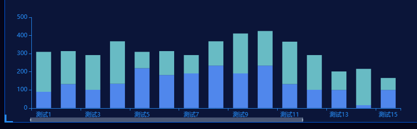
关于截图中左下角伪类样式:
<div class="chart-container">
  <div class="chart" id="myChart"></div>
  <div class="chart-footer"></div>
</div>
.chart-container{
  position: relative;
}
.chart-container::before{
  position: absolute;
  top:0;
  left:0;
  width:10px;
  height: 10px;
  border-left: 4px solid #268af2;
  border-top: 4px solid #268af2;
  content: '';
}
.chart-container::after{
  position: absolute;
  top:0;
  right:0;
  width: 10px;
  height: 10px;
  border-right: 4px solid #268af2;
  border-top: 4px solid #268faf2;
  content: '';
}
.chart-container .chart-footer{
  position:absolute;
  bottom:0;
  left:0;
  right:0;
  width: 100%;
}
.chart-container .chart-footer::before{
  position: absolute;
  bottom:0;
  left:0;
  width: 10px;
  height: 10px;
  border-left: 4px solid #268af2;
  border-bottom: 4px solid #268af2;
  content: '';
}
.chart-container .chart-footer::after{
  position: absolute;
  bottom:0;
  right:0;
  width:10px;
  height: 10px;
  border-right: 4px solid #268af2;
  border-bottom: 4px solid #268af2;
  content: '';
}
3.代码如下
// 实例化对象
const chart = document.getElementById('myChart');
if(!chart) return;
const myChart = echarts.init(chart);

// 处理滚动条以及测试数据
let dataX = ['测试1','测试2','测试3','测试4','测试5','测试6','测试7','测试8','测试9','测试10','测试11','测试12','测试13','测试14','测试15','测试16',...];
let dataY1 = [300,400,100,200,300,202,30,12,562,100,233,620,50,80,40,66,...]
let dataY2 = [200,100,202,66,56,85,100,200,521,56,95,622,100,11,22,33,...]
let showZoom = false;
if(dataX.length>12){
  showZoom = true;
}else{
  showZoom = false;
}

// 指定配置
let option = {
  background: '', // 这里没有设置背景颜色,因为图中设置了大背景颜色
  // 滚动条
  dataZoom: [
   {
     show: zoomShow,
     type: 'slider',
     realtime: true,
     startValue: 0,
     endValue: 14,
     xAxisIndex: [0],
     bottom: '0',
     left: '50',
     height: 10,
     borderColor: 'rgba(0,0,0,0)',
     textStyle: {
       color: 'transparent'
     }
  }
 ],
 tooltip: {
   trigger: 'axis',
   axisPointer: {
     type: 'shadow'
   }
 },
 legend: {
   show: false,
 },
 textStyle: {
   color: '#268AF2'
 },
 grid: {
   left: '3%',
   right: '4%',
   bottom: '3%',
   containLabel: true
 },
 xAxis: [
   {
     type: 'category',
     data: dataX,
     nameTextStyle: {
       color: '#268af2',
       fontSize: 14
     },
     axisTick:{
       show: true
     },
     splitLine: {
       show: false
     },
     axisLine: {
       show: true,
       lineStyle:{
         color: '#268af2'
       }
     }
   }
 ],
 yAxis: [
   {
     type: 'value',
     splitLine: {
       show: false
     },
     axisLine: {
       show: true,
       lineStyle: {
         color: '#268af2'
       }
     }
   }
 ],
 color: ['#5087ec', '68bbc8'],
 series: [
   {
     name: '测试1-子类1',
     type: 'bar',
     barWidth: 30,
     stack: 'Ad', // 堆叠效果
     emphasis: { focus: 'series' },
     data: dataY1
   },
   {
     name: '测试1-子类2',
     type: 'bar',
     barWidth: 30,
     stack: 'Ad',
     emphasis: { focus: 'series' },
     data: dataY2
   }
 ]
}
myChart.clear() // 清空数据
// 把配置给实例对象
myChart.setOption(option, true)
参考链接:
https://echarts.apache.org/zh/option.html#dataZoom-inside.type - eharts官方文档