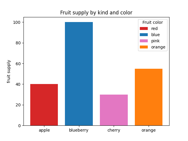
条形颜色演示
import matplotlib.pyplot as plt

'''
将plt.subplots()函数的返回值赋值给fig和ax俩个变量
plt.subplots()是一个函数,返回一个包含figure和axes对象的元组
'''
fig, ax = plt.subplots()

fruits = ['apple', 'blueberry', 'cherry', 'orange']
counts = [40, 100, 30, 55]
bar_labels = ['red', 'blue', 'pink', 'orange']
bar_colors = ['tab:red', 'tab:blue', 'tab:pink', 'tab:orange']
'''
ax.bar(x,height,width,bottom,align)
x:一个标量序列,代表柱状图的x坐标,默认x取值是每个柱状图所在的中点位置,或者也可以是柱状图左侧边缘位置
hegiht:一个标量或者是标量序列,代表柱状图的高度
width:可选参数,标量或类数组,柱状图的默认宽度值为0.8
bottom可选参数,柱状图的y坐标默认为None
algin有俩个可选项{center,edge},默认为center,该参数决定x值位于柱状图的位置

'''
# ax.bar(fruits, counts, label=bar_labels, color=bar_colors)
ax.bar(fruits, counts, label=bar_labels, color=bar_colors)
#添加y轴标题
ax.set_ylabel('fruit supply')
#图表标题
ax.set_title('Fruit supply by kind and color')
ax.legend(title='Fruit color')

# plt.savefig('./q1.jpg')`
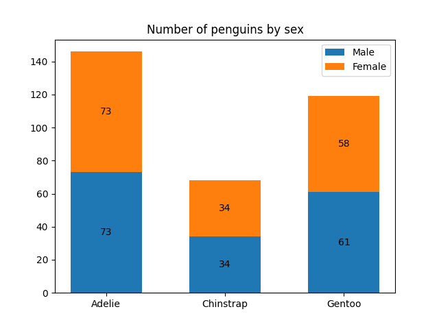
条形标签演示
import matplotlib.pyplot as plt
import numpy as np


species = ('Adelie', 'Chinstrap', 'Gentoo')
sex_counts = {
    'Male': np.array([73, 34, 61]),
    'Female': np.array([73, 34, 58]),
}
width = 0.6  # the width of the bars: can also be len(x) sequence


fig, ax = plt.subplots()
'''
np.zeros函数的作用
返回来一个给定形状和类型的用0填充的数组
zeros(shape,dtype=float,order='C')
shape:形状
dtype:数据类型,可选参数
order:可选参数,c 行优先,f列优先
'''
bottom = np.zeros(3)
# print(bottom)

for sex, sex_count in sex_counts.items():
    p = ax.bar(species, sex_count, width, label=sex, bottom=bottom)
    bottom += sex_count

    ax.bar_label(p, label_type='center')

ax.set_title('Number of penguins by sex')
#ax.legend()
ax.legend()

plt.show()
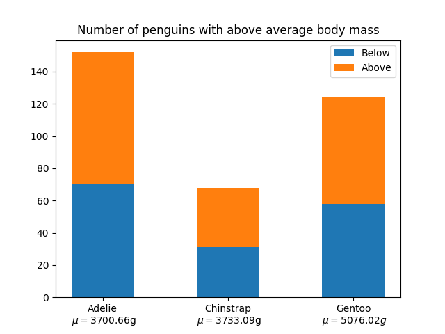
堆积条形图
import matplotlib.pyplot as plt
import numpy as np

# data from https://allisonhorst.github.io/palmerpenguins/

species = (
    "Adelie\n $\\mu=$3700.66g",
    "Chinstrap\n $\\mu=$3733.09g",
    "Gentoo\n $\\mu=5076.02g$",
)
weight_counts = {
    "Below": np.array([70, 31, 58]),
    "Above": np.array([82, 37, 66]),
}
width = 0.5

fig, ax = plt.subplots()
bottom = np.zeros(3)

for boolean, weight_count in weight_counts.items():
    p = ax.bar(species, weight_count, width, label=boolean, bottom=bottom)
    bottom += weight_count

ax.set_title("Number of penguins with above average body mass")
ax.legend(loc="upper right")

plt.show()
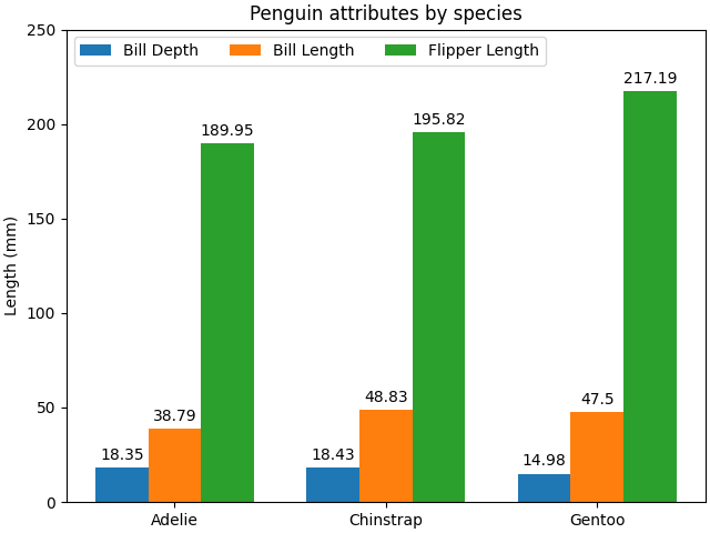
带标签的分组条形图
# data from https://allisonhorst.github.io/palmerpenguins/

import matplotlib.pyplot as plt
import numpy as np

species = ("Adelie", "Chinstrap", "Gentoo")
penguin_means = {
    'Bill Depth': (18.35, 18.43, 14.98),
    'Bill Length': (38.79, 48.83, 47.50),
    'Flipper Length': (189.95, 195.82, 217.19),
}

x = np.arange(len(species))  # the label locations
width = 0.25  # the width of the bars
multiplier = 0

fig, ax = plt.subplots(layout='constrained')

for attribute, measurement in penguin_means.items():
    offset = width * multiplier
    rects = ax.bar(x + offset, measurement, width, label=attribute)
    ax.bar_label(rects, padding=3)
    multiplier += 1

# Add some text for labels, title and custom x-axis tick labels, etc.
ax.set_ylabel('Length (mm)')
ax.set_title('Penguin attributes by species')
ax.set_xticks(x + width, species)
ax.legend(loc='upper left', ncols=3)
ax.set_ylim(0, 250)

plt.show()
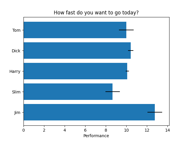
水平条形图
import matplotlib.pyplot as plt
import numpy as np

# Fixing random state for reproducibility
np.random.seed(19680801)

fig, ax = plt.subplots()

# Example data
people = ('Tom', 'Dick', 'Harry', 'Slim', 'Jim')
y_pos = np.arange(len(people))
performance = 3 + 10 * np.random.rand(len(people))
error = np.random.rand(len(people))

ax.barh(y_pos, performance, xerr=error, align='center')
ax.set_yticks(y_pos, labels=people)
ax.invert_yaxis()  # labels read top-to-bottom
ax.set_xlabel('Performance')
ax.set_title('How fast do you want to go today?')

plt.show()
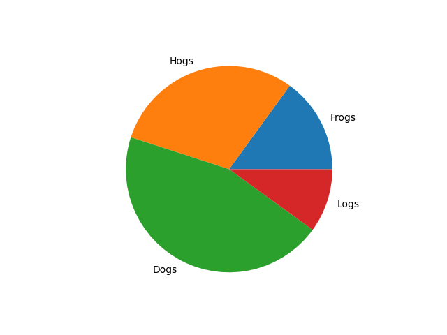
饼状图
import matplotlib.pyplot as plt

labels = 'Frogs', 'Hogs', 'Dogs', 'Logs'
sizes = [15, 30, 45, 10]

fig, ax = plt.subplots()
ax.pie(sizes, labels=labels)
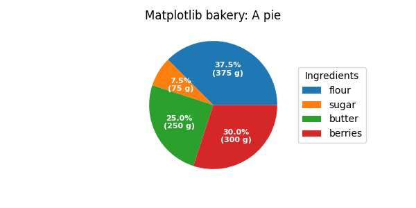
饼图和圆环图
import matplotlib.pyplot as plt
import numpy as np

fig, ax = plt.subplots(figsize=(6, 3), subplot_kw=dict(aspect="equal"))

recipe = ["375 g flour",
          "75 g sugar",
          "250 g butter",
          "300 g berries"]

data = [float(x.split()[0]) for x in recipe]
ingredients = [x.split()[-1] for x in recipe]


def func(pct, allvals):
    absolute = int(np.round(pct/100.*np.sum(allvals)))
    return f"{pct:.1f}%\n({absolute:d} g)"


wedges, texts, autotexts = ax.pie(data, autopct=lambda pct: func(pct, data),
                                  textprops=dict(color="w"))

ax.legend(wedges, ingredients,
          title="Ingredients",
          loc="center left",
          bbox_to_anchor=(1, 0, 0.5, 1))

plt.setp(autotexts, size=8, weight="bold")

ax.set_title("Matplotlib bakery: A pie")

plt.show()