功能
- 支持居中/局左/居右布局
- 可自定义线条颜色
- 默认情况下图标是圆形,可自定义圆形颜色和大小,同时也可以自定义图标
- 支持自定义内容
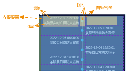
效果
const data=[
    {
        "title": "2022-12-05 12:03:40",
        "des": "茶陵县实时广播防火宣传"
    },
    ...
]
<TimeLine data={data}/>

实现思路
居左居右比较简单,这里讲一下居中的情况。居中使用的是三列的Grid布局,接着根据它的排列规则给每一个空位填充内容,包括实际内容(content)、对应的图标(icon)以及空元素(empty):
const curData = [];
let left = true;// 定义一个变量来判断当前的数据项在左侧还是在右侧,根据不同位置采取不同的填充方式
data.forEach((item) => {
   if (left) {
      curData.push({ ...item, type: 'content' });
      curData.push({ ...item, type: 'icon' });
      curData.push({ type: 'empty' });
      curData.push({ type: 'empty' });
      left = false;
   } else {
      curData.push({ ...item, type: 'icon' });
      curData.push({ ...item, type: 'content' });
      left = true;
   }
});
接着根据类型将元素渲染出来。预想情况下,第一列的内容是居右对齐;第三列是局左对齐(默认)。而现在第一列是局左的,所以需要进一步给第一列加上居右的样式,只需根据index来判断元素是否属于第一列即可:

{curData.map((item, index) => {
   const isLeft = index % 3 === 0;
   switch (item.type) {
      case 'content':
         return (
            <ContentBox
               item={item}
               boxStyle={{
                  ...ContentBoxStyle,
                  textAlign: isLeft ? 'right' : 'left' // 如果是左侧的内容,则居右对齐
               }}
               options={contentOpts}
            />
         );
      case 'icon':
         return <IconBox item={item} boxStyle={IconBoxStyle} options={iconOpts} />;
      default:
         return <div className="content-box" style={ContentBoxStyle}></div>;
   }
})}
Api
| 属性 | 类型 | 默认值 | 描述 |
|---|---|---|---|
| data | Array<TimeLineInfo> |
[] |
数据项数组 |
| mode | middle / left / right |
middle |
布局模式 |
| lineColor | String |
#eee |
线条颜色 |
| rowGap | Number |
0 |
每项的行间距,支持负数 |
| verticalAlign | center / top / bottom |
center |
内容垂直对齐方式 |
| titleStyle | Object |
{} |
标题样式(如果data中定义了,这里的会被覆盖) |
| desStyle | Object |
{} |
描述样式(如果data中定义了,这里的会被覆盖) |
| circleColor | String |
#00ccff |
圆形图标颜色(如果data中定义了,这里的会被覆盖) |
| circleSize | Number |
12 |
圆形图标大小(如果data中定义了,这里的会被覆盖) |
| getCustomContent | (TimeLineInfo) => jsx |
- |
自定义内容(此时title和des无效) |
| getContentBoxStyle | (TimeLineInfo) => Object |
- |
自定义内容容器样式 |
| getIconBoxStyle | (TimeLineInfo) => Object |
- |
自定义图标容器样式 |
TimeLineInfo
可以为单独的数据项自定义样式,在这里定义的样式优先级最高
| 属性 | 类型 | 默认值 | 描述 |
|---|---|---|---|
| title | String |
- | 标题 |
| des | String |
- | 描述 |
| titleStyle | Object |
- | 标题样式 |
| desStyle | Object |
- | 描述样式 |
| circleColor | String |
- | 圆形图标颜色 |
| circleSize | Number |
- | 圆形图标大小 |
| CustomContent | JSX对象 |
- | 自定义内容 |
| CustomIcon | JSX对象 |
- | 自定义图标 |
源码
jsx
import React from 'react';

const getStyleObj = ({ rowGap, verticalAlign }) => {
   let alignItems = 'center';
   switch (verticalAlign) {
      case 'top':
         alignItems = 'baseline';
         break;
      case 'bottom':
         alignItems = 'end';
         break;
      default:
         break;
   }

   // 内容容器样式
   const ContentBoxStyle = {
      // 在middle布局下 每一列的item上下空余会很多,所以允许传入负数要缩小间距
      ...(rowGap > 0 ? { padding: `${rowGap}px 0` } : { margin: `${rowGap}px 0` })
   };

   // 图标容器样式
   const IconBoxStyle = {
      ...ContentBoxStyle,
      alignItems
   };

   return { ContentBoxStyle, IconBoxStyle };
};

const getClassifiedOpts = (options) => {
   let { lineColor, circleColor, circleSize, titleStyle, desStyle, getCustomContent, getContentBoxStyle, getIconBoxStyle } = options;
   let iconOpts = {
      lineColor,
      circleColor,
      circleSize,
      getIconBoxStyle
   };
   let contentOpts = {
      titleStyle,
      desStyle,
      getCustomContent,
      getContentBoxStyle
   };

   return { iconOpts, contentOpts };
};

// 图标容器组件
const IconBox = ({ item, boxStyle, options }) => {
   let { lineColor, circleColor, circleSize, getIconBoxStyle } = options; // 默认样式
   return (
      <div className="icon-box" style={{ ...boxStyle, ...getIconBoxStyle(item) }}>
         <div className="line" style={{ background: lineColor }}></div>
         {item.CustomIcon ? (
            item.CustomIcon
         ) : (
            <div
               className="icon"
               style={{
                  height: `${item.circleSize || circleSize}px`,
                  width: `${item.circleSize || circleSize}px`,
                  background: item.circleColor || circleColor
               }}
            ></div>
         )}
      </div>
   );
};

// 内容容器组件
const ContentBox = ({ item, boxStyle, options }) => {
   let { titleStyle, desStyle, getCustomContent, getContentBoxStyle } = options; // 默认样式

   const getContent = () => {
      if (getCustomContent) {
         return getCustomContent(item);
      } else {
         return (
            <React.Fragment>
               <div style={item.titleStyle || titleStyle}>{item.title}</div>
               <div style={item.desStyle || desStyle}>{item.des}</div>
            </React.Fragment>
         );
      }
   };

   return (
      <div className="content-box" style={{ ...boxStyle, ...getContentBoxStyle(item) }}>
         {item.CustomContent ? item.CustomContent : getContent()}
      </div>
   );
};

// 居中布局
const MiddleDisplay = ({ data, options }) => {
   const { ContentBoxStyle, IconBoxStyle } = getStyleObj(options);
   const { iconOpts, contentOpts } = getClassifiedOpts(options);

   const curData = [];
   let left = true;
   data.forEach((item) => {
      if (left) {
         curData.push({ ...item, type: 'content' });
         curData.push({ ...item, type: 'icon' });
         curData.push({ type: 'empty' });
         curData.push({ type: 'empty' });
         left = false;
      } else {
         curData.push({ ...item, type: 'icon' });
         curData.push({ ...item, type: 'content' });
         left = true;
      }
   });

   return curData.length !== 0 ? (
      <React.Fragment>
         {curData.map((item, index) => {
            const isLeft = index % 3 === 0;
            switch (item.type) {
               case 'content':
                  return (
                     <ContentBox
                        item={item}
                        boxStyle={{
                           ...ContentBoxStyle,
                           textAlign: isLeft ? 'right' : 'left' // 如果是左侧的内容,则居右对齐
                        }}
                        options={contentOpts}
                     />
                  );
               case 'icon':
                  return <IconBox item={item} boxStyle={IconBoxStyle} options={iconOpts} />;
               default:
                  return <div className="content-box" style={ContentBoxStyle}></div>;
            }
         })}
      </React.Fragment>
   ) : null;
};

// 左/右布局
const NormalDisplay = ({ data, mode, options }) => {
   const { ContentBoxStyle, IconBoxStyle } = getStyleObj(options);
   const { iconOpts, contentOpts } = getClassifiedOpts(options);

   if (data.length === 0) return null;
   return mode === 'left' ? (
      <React.Fragment>
         {data.map((item) => (
            <React.Fragment>
               <IconBox item={item} boxStyle={IconBoxStyle} options={iconOpts} />
               <ContentBox item={item} boxStyle={ContentBoxStyle} options={contentOpts} />
            </React.Fragment>
         ))}
      </React.Fragment>
   ) : (
      <React.Fragment>
         {data.map((item) => (
            <React.Fragment>
               <ContentBox
                  item={item}
                  boxStyle={{
                     ...ContentBoxStyle,
                     textAlign: 'right'
                  }}
                  options={contentOpts}
               />
               <IconBox item={item} boxStyle={IconBoxStyle} options={iconOpts} />
            </React.Fragment>
         ))}
      </React.Fragment>
   );
};

const TimeLine = ({
   data,
   mode = 'middle', // 默认为左右两侧分布
   lineColor = '#eee', // 线条颜色
   rowGap = 0, // 行距
   style = {},
   className = '',
   getCustomContent = null, // (item)=> jsx,  将会把data中的item作为参数
   getContentBoxStyle = () => ({}), //  (item)=> object, 将会把data中的item作为参数  自定义容器样式
   getIconBoxStyle = () => ({}), //  (item)=> object, 将会把data中的item作为参数  自定义容器样式

   // data里面定义的以下样式 优先于 组件属性的样式
   verticalAlign = 'center', // 对齐方式
   circleColor = '#00ccff', // 圆形颜色
   circleSize = 12, // 圆形大小 单位px
   titleStyle = {}, // 标题样式
   desStyle = {} // 描述样式
}) => {
   let Content;
   switch (mode) {
      case 'middle':
         Content = MiddleDisplay;
         break;
      case 'left':
      case 'right':
         Content = NormalDisplay;
         break;
      default:
         break;
   }

   return (
      <div className={`time_line grid ${mode} ${className}`} style={style}>
         <Content
            data={data}
            mode={mode}
            options={{
               verticalAlign,
               rowGap,
               lineColor,
               circleColor,
               circleSize,
               titleStyle,
               desStyle,
               getCustomContent,
               getContentBoxStyle,
               getIconBoxStyle
            }}
         />
      </div>
   );
};

export default TimeLine;
css
.time_line {
   &.grid{
      display: grid;
      grid-column-gap: 0px;
      grid-row-gap: 0px;
   }
   &.middle {
      grid-template-columns: 1fr 27px 1fr;
   }
   &.left {
      grid-template-columns: 27px 1fr;
   }
   &.right {
      grid-template-columns: 1fr 27px;
   }
   .content-box {
   }
   .icon-box {
      display: flex;
      justify-content: center;
      align-items: center;
      position: relative;
      > .line {
         position: absolute;
         height: 100%;
         content: '';
         width: 1px;
         background-color: #eee;
         z-index: -1;
      }
      > .icon {
         border-radius: 50%;
         background-color: #00ccff;
      }
   }
}