matplotlib网格坐标刻度
概要
plt.title()      # 标题
plt.grid()   	 # 网格
plt.xlabel()     # 坐标说明
plt.xscale()	 # 坐标格式
plt.xlim()       # 坐标范围
plt.xaxis()      # 刻度
plt.xticks()     # 刻度标签
plt.xaxis.set_major_locator() # 刻度步长
网格设置
matplotlib.pyplot.grid(b=None, which='major', axis='both',**kwargs)

kwargs 可输入以下参数
color = 'color', linestyle = 'linestyle', linewidth = number
b:			可选,默认为 None,可以设置布尔值,true 为显示网格线,false 为不显示,如果设置 **kwargs 参数,则值为 true。
which:		可选,可选值有 'major'、'minor' 和 'both',默认为 'major',表示应用更改的网格线。
axis:		可选,设置显示哪个方向的网格线,可以是取 'both'(默认),'x' 或 'y',分别表示两个方向,x 轴方向或 y 轴方向。

**kwargs:	可选,设置网格样式,可以是 color='r', linestyle='-' 和 linewidth=2,分别表示网格线的颜色,样式和宽度
color:		'b' 蓝色,'m' 洋红色,'g' 绿色,'y' 黄色,'r' 红色,'k' 黑色,'w' 白色,'c' 青绿色,'#008000' RGB 颜色符串。
linestyle:	'‐' 实线,'‐‐' 破折线,'‐.' 点划线,':' 虚线。
linewidth:	设置线的宽度,可以设置一个数字
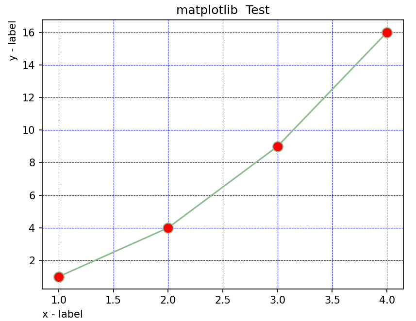
import numpy as np
import matplotlib.pyplot as plt

x = np.array([1, 2, 3, 4])
y = np.array([1, 4, 9, 16])

plt.plot(x, y , c = '#8FBC8F',marker = 'o', ms = 10, mfc = 'r')

plt.title("matplotlib  Test")
plt.xlabel("x - label",loc="left")
plt.ylabel("y - label", loc="top")

plt.grid(color = 'b', linestyle = '--', linewidth = 0.5)
plt.show()
坐标轴
坐标轴范围
plt.xlim(...)    # 设置X轴范围
plt.ylim(...)    # 设置Y轴范围
import matplotlib.plot as plt

_, ax = plt.subplots(2, 1)
x = np.array(range(0, 8))
y = np.random.randint(1, 100, 8)
ax[0].set_xlim(3, 6)			 #X轴范围3~6
ax[0].plot(x, y)

x = np.array(range(10, 18))
y = np.random.randint(100, 200, 8)
ax[1].set_ylim(120, 150)  		#Y轴范围120~150
ax[1].plot(x, y)
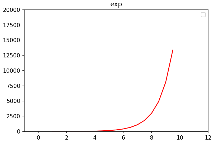
import numpy as np
import matplotlib.pyplot as plt

fig, ax = plt.subplots(figsize=(6, 4))

x = np.arange(1,10,0.5)
ax.plot(x, np.exp(x),'r')
ax.set_title('exp')
#设置y轴
ax.set_ylim(0,20000)
#设置x轴
ax.set_xlim(-1,12)

plt.legend()
plt.show()
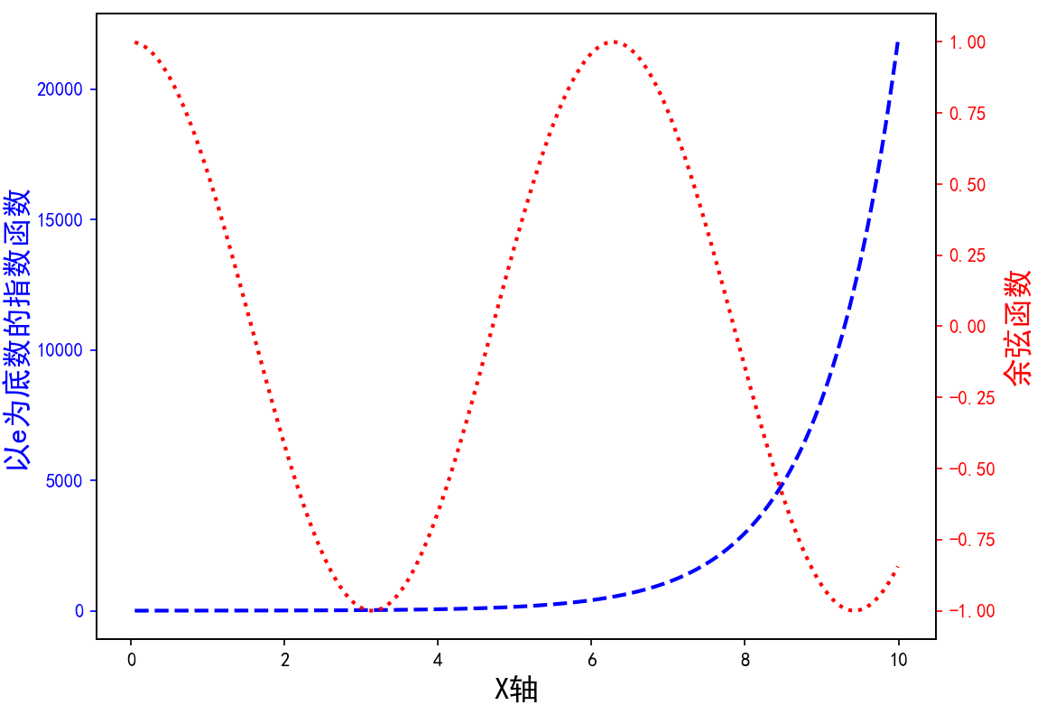
双坐标轴
import matplotlib.pyplot as plt
import matplotlib as mpl
import numpy as np
mpl.rcParams['font.sans-serif'] = ['SimHei']
mpl.rcParams['axes.unicode_minus'] = False


t = np.arange(0.05, 10.0, 0.01)
s1 = np.exp(t)
s2 = np.cos(t)

fig, ax = plt.subplots(figsize=(8, 6))
ax.plot(t, s1, c='b',ls='--',label='$\exp(x)$',linewidth=2)
ax.set_xlabel('X轴', fontsize=16)
ax.set_ylabel('以e为底数的指数函数', color='b', fontsize=16)
ax.tick_params('y', colors='b')

ax2 = ax.twinx()
ax2.plot(t, s2, c='r', ls=":",label='$\cos(x)$',linewidth=2)
ax2.set_ylabel('余弦函数',color='r', fontsize=16)
ax2.tick_params('y', colors='r')

plt.legend()
plt.show()
反转坐标轴
ax.set_xlim(5, 0) # decreasing time,传入的 x 范围 left 和 right 大小反转
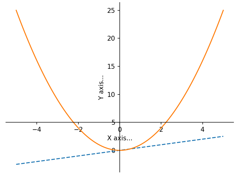
坐标轴的位置
import matplotlib.pyplot as plt
import numpy as np

x = np.linspace(-5, 5, 100)
y1 = 0.5 * x
y2 = x * x

plt.figure()
plt.xlabel('X axis...')
plt.ylabel('Y axis...')                        #设置坐标轴的文字标签

ax = plt.gca()                                 # get current axis 获得坐标轴对象

ax.spines['right'].set_color('none')           # spine 这个单词的意思是脊梁,应该就是包围图表的线条
ax.spines['top'].set_visible(False)            # 将右边、上边的两条边颜色设置为空 其实就相当于抹掉这两条边,或者是用set_visible设置为False

ax.xaxis.set_ticks_position('bottom')          # 设定坐标轴位置
ax.yaxis.set_ticks_position('left')            #

ax.spines['bottom'].set_position(('data', 5))  # 指定data设置的bottom(也就是指定的x轴)绑定到y轴的0这个点上
ax.spines['left'].set_position(('data', 0))    # 这个data的函数似乎还不太清楚

plt.plot(x, y1, linestyle='--')
plt.plot(x, y2)

plt.show()
刻度
主次刻度
ax.xaxis.set_major_locator(locator) :用于设置 x 轴主刻度。
ax.xaxis.set_minor_locator(locator) :用于设置 x 轴副刻度。
ax.yaxis.set_major_locator(locator) :用于设置 y 轴主刻度。
ax.yaxis.set_minor_locator(locator) :用于设置 y 轴副刻度。
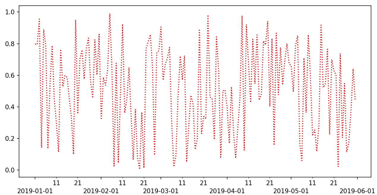
import numpy as np
from matplotlib import pyplot as plt
import matplotlib.dates as mdates
x = np.arange('2019-01', '2019-06', dtype='datetime64[D]')
y = np.random.rand(x.shape[0])
fig = plt.figure()
ax = fig.add_axes([0.1, 0.1, 0.8, 0.8])
ax.plot(x, y, c='r',ls=':')
ax.xaxis.set_major_locator(mdates.MonthLocator())
ax.xaxis.set_major_formatter(mdates.DateFormatter('\n%Y-%m-%d'))
ax.xaxis.set_minor_locator(mdates.DayLocator(bymonthday=(1,11,21)))
ax.xaxis.set_minor_formatter(mdates.DateFormatter('%d'))
plt.show()
支持使用自定义函数 使用定位器和格式器,设置坐标轴刻度向内
参考 https://zhuanlan.zhihu.com/p/462492568
参考 https://zhuanlan.zhihu.com/p/448571003
颜色大小角度样式
plt.xticks(rotation=45) 	# 旋转45度
obj = ax.get_xticklabels()  # 获取刻度对象
obj.set_size(20)			# 设置大小
obj.set_color("red")        # 设置颜色
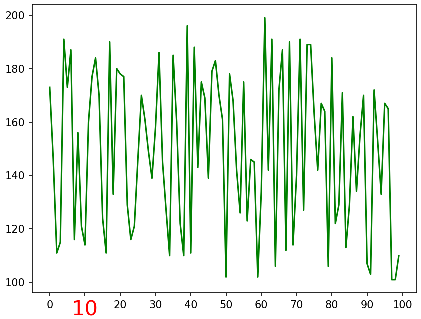
import numpy as np
from matplotlib import pyplot as plt
from matplotlib.ticker import MultipleLocator

x = np.array(range(0, 100))
y = np.random.randint(100, 200, 100)

fig = plt.figure()
ax = fig.add_axes([0.1, 0.1, 0.8, 0.8])
ax.xaxis.set_major_locator(MultipleLocator(10))

obj = ax.get_xticklabels()[2]
obj.set_size(20)
obj.set_color("red")

ax.plot(x, y, color='g')
刻度标签文本
plt.xticks()
plt.yticks()

ax.set_xticks()
ax.set_yticks()

可以设定 color='blue',rotation=60

ax.set_xticklabels(['zero','two','four','six'])
import matplotlib.pyplot as plt
import numpy as np
import math
x = np.arange(0, math.pi*2,0.05)
#生成画布对象
fig = plt.figure()
#添加绘图区域
ax = fig.add_axes([0.1,0.1,0.8,0.8])
y = np.sin(x)
ax.plot(x, y)
#设置x轴标签
ax.set_xlabel('angle')
ax.set_title('sine')
ax.set_xticks([0,2,4,6])
#设置x轴刻度标签
ax.set_xticklabels(['zero','two','four','six'])
#设置y轴刻度
ax.set_yticks([-1,0,1])
plt.show()
刻度密度
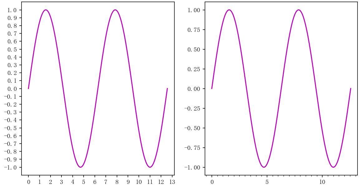
import numpy as np
from matplotlib import pyplot as plt
from matplotlib.ticker import MultipleLocator
plt.rcParams['font.sans-serif'] = ['FangSong']
plt.rcParams['axes.unicode_minus'] = False
x = np.linspace(0, 4*np.pi, 500)
fig = plt.figure()
ax1 = fig.add_subplot(121)
ax1.plot(x, np.sin(x), c='m')
ax1.xaxis.set_major_locator(MultipleLocator(1))
ax1.yaxis.set_major_locator(MultipleLocator(0.1))
ax2 = fig.add_subplot(122)
ax2.plot(x, np.sin(x), c='m')
ax2.xaxis.set_major_locator(MultipleLocator(5))
ax2.xaxis.set_minor_locator(MultipleLocator(0.5))
plt.show()
中文乱码处理
#绘制折线图
import matplotlib.pyplot as plt
plt.rcParams["font.sans-serif"]=["SimHei"]#设置字体
plt.rcParams["axes.unicode_minus"]=False #正常显示负号
year=[2017,2018,2019,2020]
people=[20,40,60,70]
#生成图表
plt.plot(year, people)
plt.xlabel('年份')
plt.ylabel('人口')
plt.title('人口增长')
#设置纵坐标刻度
plt.yticks([0,20,40,60,80])
#设置填充选项:参数分别对应横坐标,纵坐标,纵坐标填充起始值,填充颜色
plt.fill_between(year, people,20, color ='green')
#显示图表
plt.show()