一.选题背景
猪肉是餐桌上重要的动物性食品之一,因其纤维较为细软,结缔组织较少,肌肉组织中含有较多的肌间脂肪,成为中国餐桌上不可缺少的一种食材。受餐饮业恢复、消费回暖的带动,猪肉消费逐步增加,生猪价格持续回升,猪肉及相关行业正处于逐步回暖状态。市场猪肉供应和合理价格运行,是涉及千家万户关系的国计民生的大事。
二.数据分析设计方案
数据爬取、数据预处理与可视化、数据简单回归分析、误差分析与可视化四大模块组成。爬取互联网上的生猪(包括外三元、内三元和土杂猪)的价格和相关饲料原料(玉米和豆粕)的价格数据,判断生猪价格的趋势,预测生猪价格随玉米价格变化的情况、以及进行数据处理分析、与可视化。
三.数据分析步骤
1.数据源
数据集来源:https://zhujia.zhuwang.cc
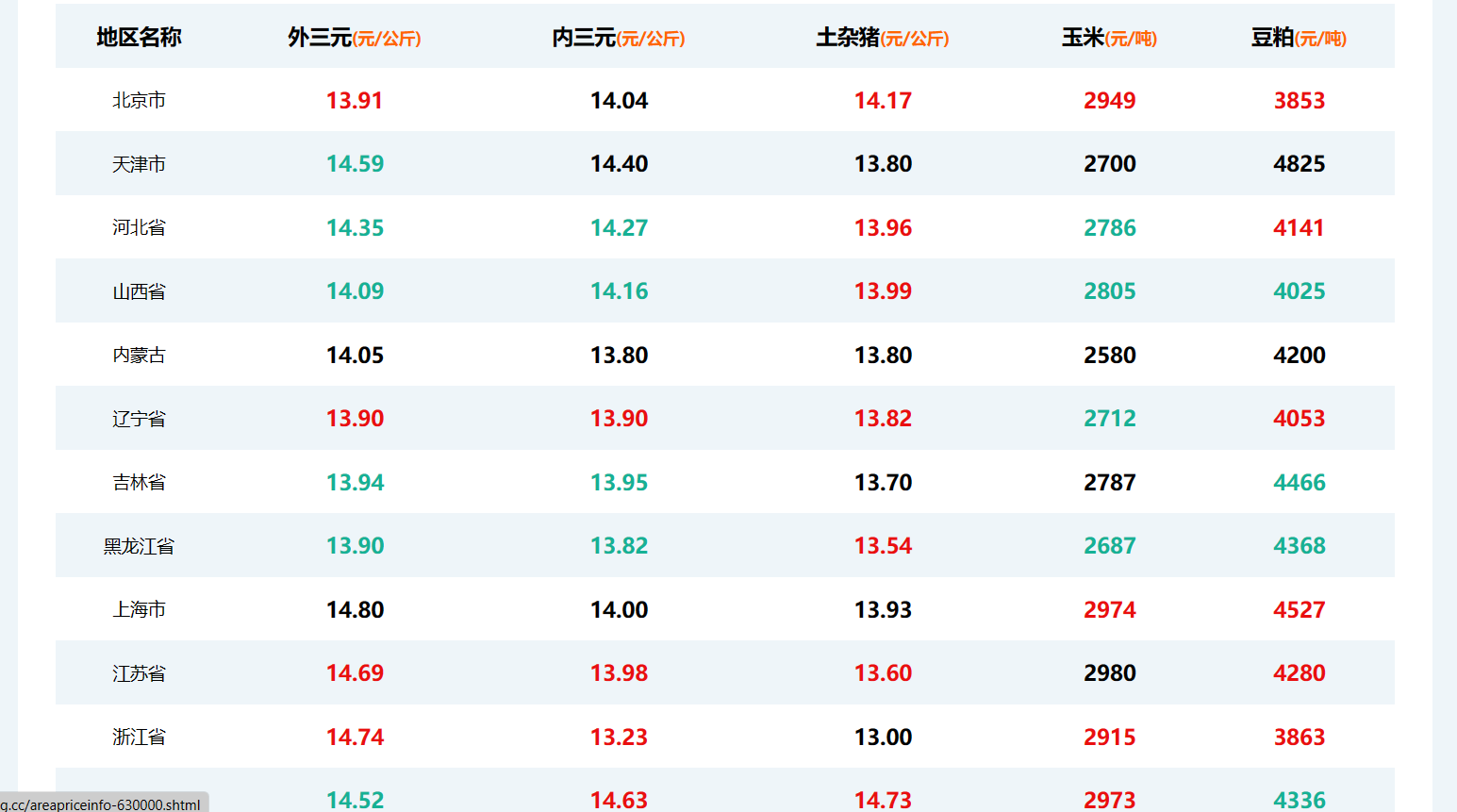
2.数据的爬取与采集
爬取数据代码
 1 import requests
 2 from bs4 import BeautifulSoup
 3 import openpyxl
 4
 5 # Send a GET request to the URL
 6 url = 'https://zhujia.zhuwang.cc'
 7 response = requests.get(url)
 8
 9 # Parse the HTML content using BeautifulSoup
10 soup = BeautifulSoup(response.content, 'html.parser')
11
12 # Find the relevant table
13 table = soup.find('div', class_='relevant-areas-detail').find('table')
14
15 # Extract the data from the table
16 data = []
17 header = ['地区名称', '外三元(元/公斤)', '内三元(元/公斤)', '土杂猪(元/公斤)', '玉米(元/吨)', '豆粕(元/吨)']
18 data.append(header)
19
20 for row in table.find_all('tr'):
21     columns = row.find_all('td')
22     if len(columns) > 0:
23         area = columns[0].text.strip()
24         outer_pig = columns[1].text.strip()
25         inner_pig = columns[2].text.strip()
26         local_pig = columns[3].text.strip()
27         corn = columns[4].text.strip()
28         soybean_meal = columns[5].text.strip()
29         data.append([area, outer_pig, inner_pig, local_pig, corn, soybean_meal])
30
31 # Create a new Excel workbook and select the active sheet
32 workbook = openpyxl.Workbook()
33 sheet = workbook.active
34
35 # Write the data to the Excel sheet
36 for row in data:
37     sheet.append(row)
38
39 # Save the workbook to a file
40 filename = "C:\\Users\\H\\Desktop\\sfdss\\data.xlsx"
41 workbook.save(filename)
42 print(f"Data saved to {filename}")
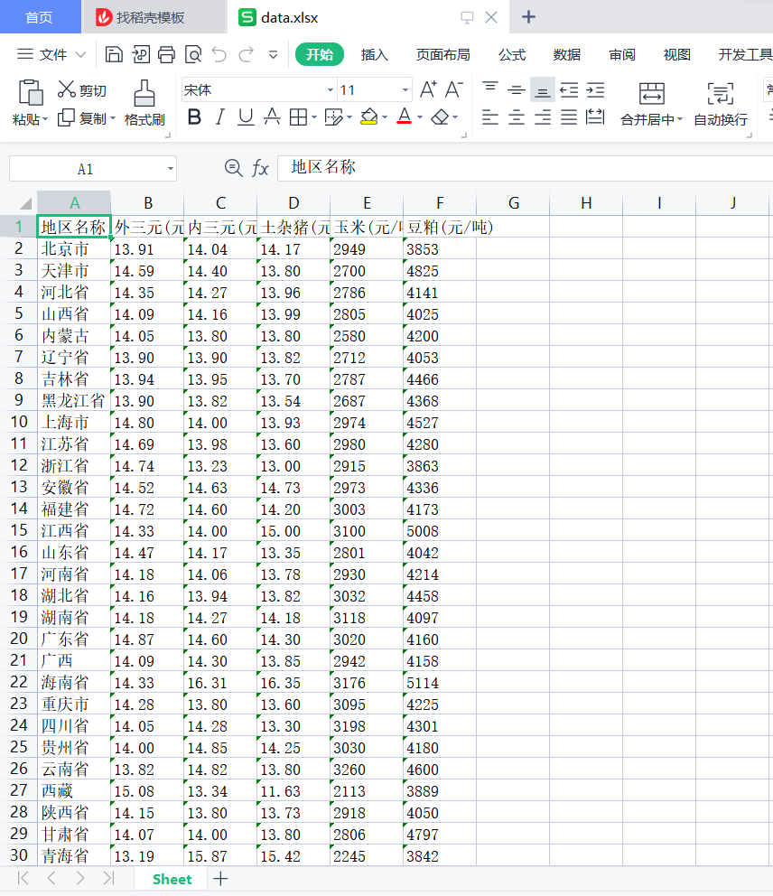
爬取后的信息保存到xlsx文件中,如图所示
对数据进行清洗并保存在xlsx文件中,代码如下
 1 import pandas as pd
 2
 3 # 加载Excel文件
 4 filename ="C:\\Users\\H\\Desktop\\sfdss\\data.xlsx"
 5 df = pd.read_excel(filename)
 6
 7 # 列名列表
 8 columns_to_convert = ['外三元(元/公斤)', '内三元(元/公斤)', '土杂猪(元/公斤)', '玉米(元/吨)', '豆粕(元/吨)']
 9
10 # 更改指定列的数据类型为浮点型(除表头外)
11 for column in columns_to_convert:
12     if column in df.columns:
13         df[column] = pd.to_numeric(df[column], errors='coerce')
14
15 # 保存更改后的数据到新的Excel文件
16 cleaned_filename ="C:\\Users\\H\\Desktop\\sfdss\\data.xlsx"
17 df.to_excel(cleaned_filename, index=False)
18
19 print(f"数据已清洗并保存到 {cleaned_filename}")
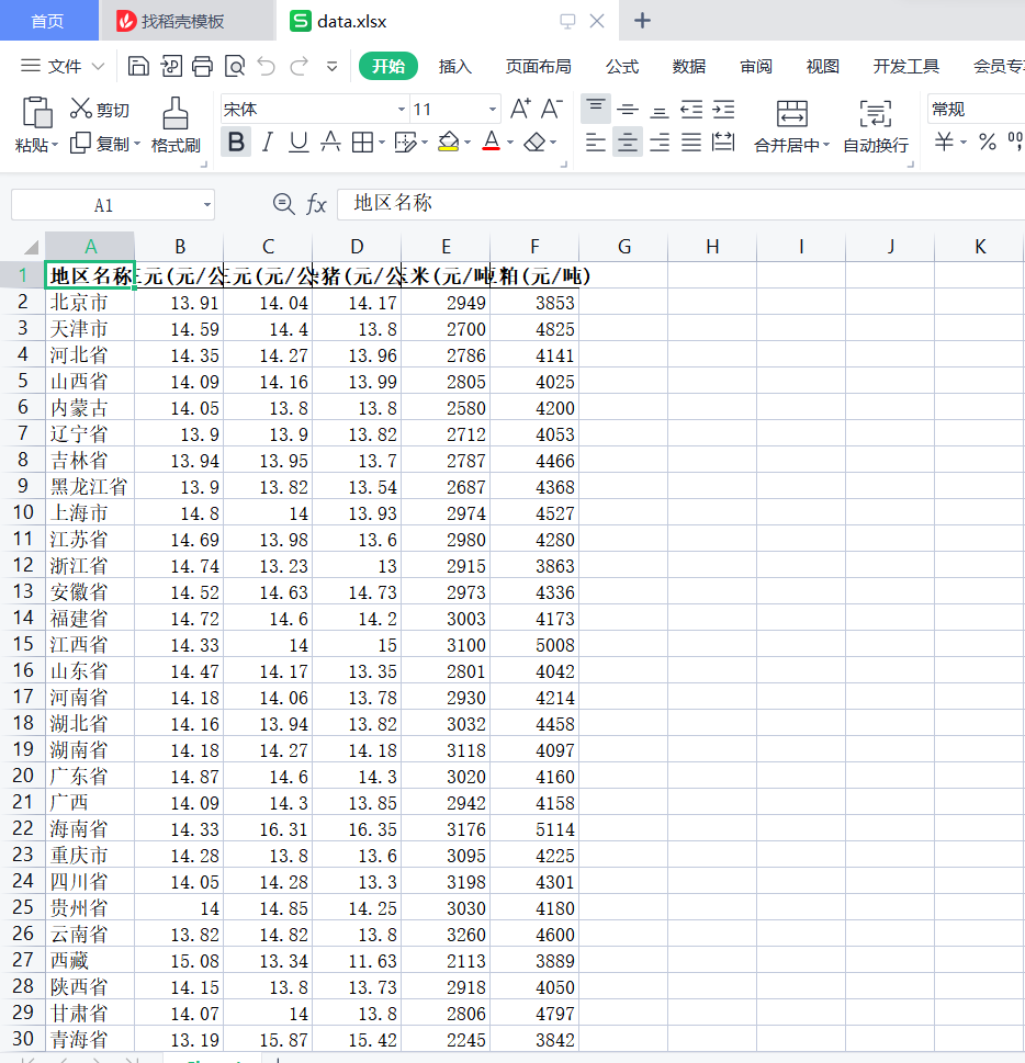
清洗后的数据
数据分析及可视化处理,以及简单的分析
代码
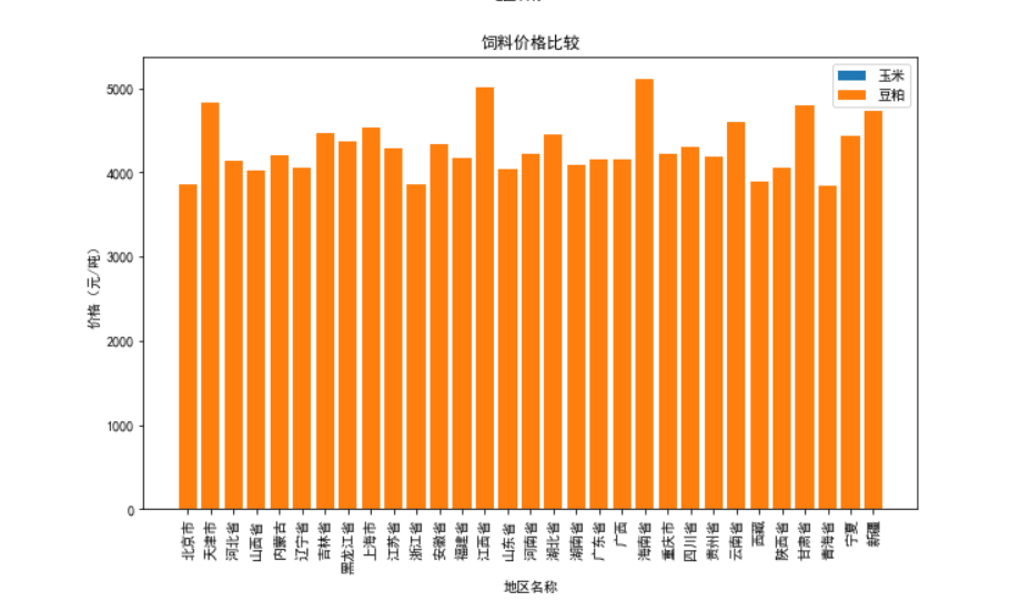
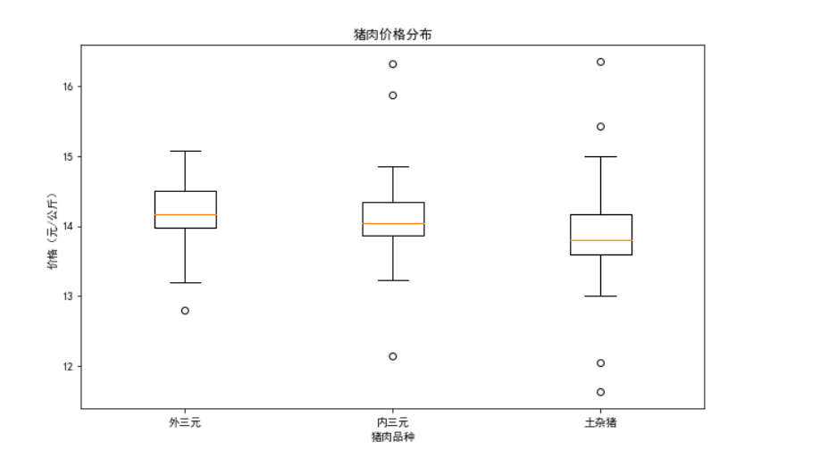
 1 import pandas as pd
 2 import matplotlib.pyplot as plt
 3 from pylab import mpl
 4
 5 # 设置显示中文字体
 6 mpl.rcParams["font.sans-serif"] = ["SimHei"]
 7
 8
 9 # 加载已清洗的Excel文件
10 filename = "C:\\Users\\H\\Desktop\\sfdss\\data.xlsx"
11 df = pd.read_excel(filename)
12
13 # 可视化分析
14
15 # 绘制折线图
16 plt.figure(figsize=(10, 6))
17 plt.plot(df['地区名称'], df['外三元(元/公斤)'], label='外三元')
18 plt.plot(df['地区名称'], df['内三元(元/公斤)'], label='内三元')
19 plt.plot(df['地区名称'], df['土杂猪(元/公斤)'], label='土杂猪')
20 plt.xlabel('地区名称')
21 plt.ylabel('价格(元/公斤)')
22 plt.title('猪肉价格趋势')
23 plt.legend()
24 plt.xticks(rotation=90)
25 plt.show()
26
27 # 绘制柱状图
28 plt.figure(figsize=(10, 6))
29 plt.bar(df['地区名称'], df['玉米(元/吨)'], label='玉米')
30 plt.bar(df['地区名称'], df['豆粕(元/吨)'], label='豆粕')
31 plt.xlabel('地区名称')
32 plt.ylabel('价格(元/吨)')
33 plt.title('饲料价格比较')
34 plt.legend()
35 plt.xticks(rotation=90)
36 plt.show()
37
38 # 绘制箱线图
39 plt.figure(figsize=(10, 6))
40 plt.boxplot([df['外三元(元/公斤)'], df['内三元(元/公斤)'], df['土杂猪(元/公斤)']])
41 plt.xlabel('猪肉品种')
42 plt.ylabel('价格(元/公斤)')
43 plt.title('猪肉价格分布')
44 plt.xticks(ticks=[1, 2, 3], labels=['外三元', '内三元', '土杂猪'])
45 plt.show()
运行结果

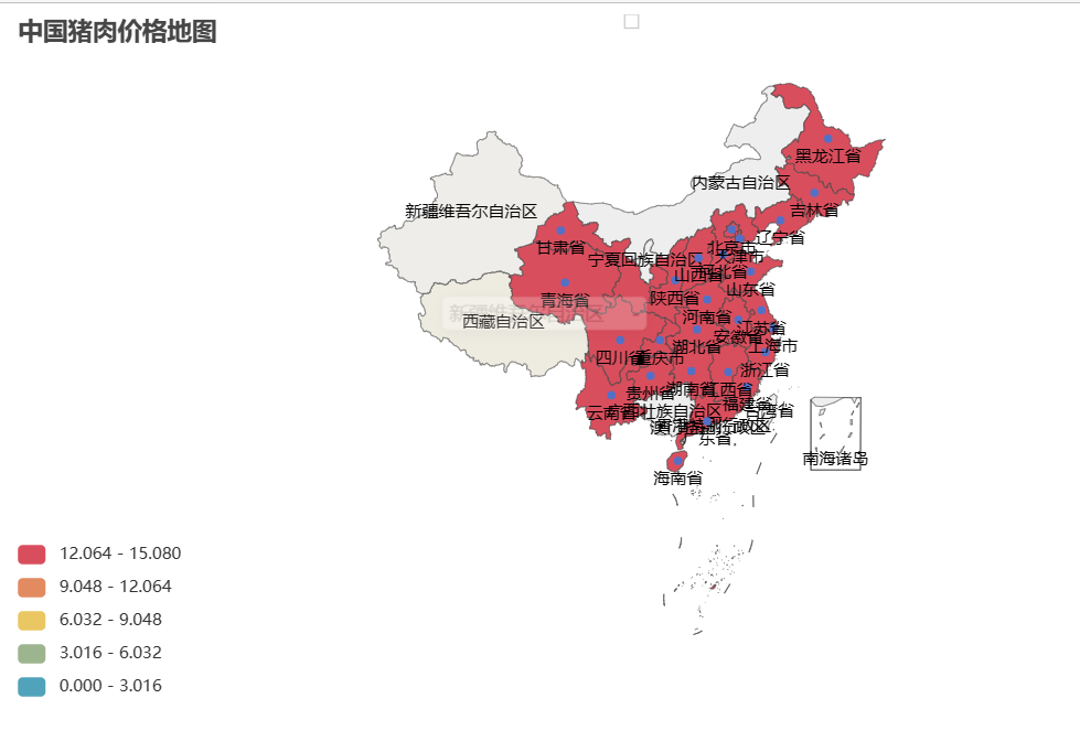
将各个地区的猪肉价格绘制成地图
代码
 1 import webbrowser
 2 import pandas as pd
 3 from pyecharts.charts import Map
 4 from pyecharts import options as opts
 5
 6 # 加载已清洗的Excel文件
 7 filename = "C:\\Users\\H\\Desktop\\sfdss\\data.xlsx"
 8 df = pd.read_excel(filename)
 9
10 # 创建地图实例
11 map_chart = Map()
12
13 # 添加数据
14 data = [(row['地区名称'], row['外三元(元/公斤)']) for _, row in df.iterrows()]
15 map_chart.add("", data, "china")
16
17 # 设置地图样式和配置
18 map_chart.set_global_opts(
19     title_opts=opts.TitleOpts(title="中国猪肉价格地图"),
20     visualmap_opts=opts.VisualMapOpts(max_=max(df['外三元(元/公斤)']), is_piecewise=True),
21 )
22
23 # 生成 HTML 文件并存储地图
24 save_path = 'C:\\UsersH\Desktop\sfdss\\猪肉价格地图.html'
25 map_chart.render(save_path)
26
27 # 使用 webbrowser 打开地图文件
28 webbrowser.open(save_path)
运行结果
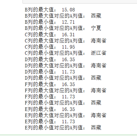
求取生猪(包括外三元、内三元和土杂猪)的价格和相关饲料原料(玉米和豆粕)的价格的最值
代码
 1 import pandas as pd
 2
 3 # 读取数据
 4 df = pd.read_excel('D:\\Edge download\\cleaned_data.xlsx')
 5
 6 # 计算B列的最大值和最小值,并打印对应的A列
 7 max_b = df['外三元(元/公斤)'].max()
 8 min_b = df['外三元(元/公斤)'].min()
 9 a_max_b = df.loc[df['外三元(元/公斤)'] == max_b, '地区名称'].values[0]
10 a_min_b = df.loc[df['外三元(元/公斤)'] == min_b, '地区名称'].values[0]
11 print("B列的最大值:", max_b)
12 print("B列的最大值对应的A列值:", a_max_b)
13 print("B列的最小值:", min_b)
14 print("B列的最小值对应的A列值:", a_min_b)
15
16 # 计算C列的最大值和最小值,并打印对应的A列
17 max_c = df['内三元(元/公斤)'].max()
18 min_c = df['内三元(元/公斤)'].min()
19 a_max_c = df.loc[df['内三元(元/公斤)'] == max_c, '地区名称'].values[0]
20 a_min_c = df.loc[df['内三元(元/公斤)'] == min_c, '地区名称'].values[0]
21 print("C列的最大值:", max_c)
22 print("C列的最大值对应的A列值:", a_max_c)
23 print("C列的最小值:", min_c)
24 print("C列的最小值对应的A列值:", a_min_c)
25
26 # 计算D列的最大值和最小值,并打印对应的A列
27 max_d = df['土杂猪(元/公斤)'].max()
28 min_d = df['土杂猪(元/公斤)'].min()
29 a_max_d = df.loc[df['土杂猪(元/公斤)'] == max_d, '地区名称'].values[0]
30 a_min_d = df.loc[df['土杂猪(元/公斤)'] == min_d, '地区名称'].values[0]
31 print("D列的最大值:", max_d)
32 print("D列的最大值对应的A列值:", a_max_d)
33 print("D列的最小值:", min_d)
34 print("D列的最小值对应的A列值:", a_min_d)
35
36
37 # 计算F列的最大值和最小值,并打印对应的A列
38 max_f = df['土杂猪(元/公斤)'].max()
39 min_f = df['土杂猪(元/公斤)'].min()
40 a_max_f = df.loc[df['土杂猪(元/公斤)'] == max_f, '地区名称'].values[0]
41 a_min_f = df.loc[df['土杂猪(元/公斤)'] == min_f, '地区名称'].values[0]
42 print("F列的最大值:", max_d)
43 print("F列的最大值对应的A列值:", a_max_d)
44 print("F列的最小值:", min_d)
45 print("F列的最小值对应的A列值:", a_min_d)
46
47 # 计算E列的最大值和最小值,并打印对应的A列
48 max_e = df['土杂猪(元/公斤)'].max()
49 min_e = df['土杂猪(元/公斤)'].min()
50 a_max_e = df.loc[df['土杂猪(元/公斤)'] == max_e, '地区名称'].values[0]
51 a_min_e = df.loc[df['土杂猪(元/公斤)'] == min_e, '地区名称'].values[0]
52 print("E列的最大值:", max_d)
53 print("E列的最大值对应的A列值:", a_max_d)
54 print("E列的最小值:", min_d)
55 print("E列的最小值对应的A列值:", a_min_d)
运行结果
将生猪价格与饲料价格进行对比并绘制其关系图
代码
 1 import pandas as pd
 2 import matplotlib.pyplot as plt
 3
 4 # 读取数据
 5 df = pd.read_excel("C:\\Users\\H\\Desktop\\sfdss\\data.xlsx")
 6
 7 # 创建画布
 8 fig, axs = plt.subplots(2, 3, figsize=(15, 10))
 9
10 # 绘制B与E列的关系图
11 axs[0, 0].plot(df['外三元(元/公斤)'], df['玉米(元/吨)'])
12 axs[0, 0].set_xlabel('B')
13 axs[0, 0].set_ylabel('E')
14 axs[0, 0].set_title('Relationship between B and E')
15
16 # 绘制B与F列的关系图
17 axs[0, 1].plot(df['外三元(元/公斤)'], df['豆粕(元/吨)'])
18 axs[0, 1].set_xlabel('B')
19 axs[0, 1].set_ylabel('F')
20 axs[0, 1].set_title('Relationship between B and F')
21
22 # 绘制C与E列的关系图
23 axs[0, 2].plot(df['内三元(元/公斤)'], df['玉米(元/吨)'])
24 axs[0, 2].set_xlabel('C')
25 axs[0, 2].set_ylabel('E')
26 axs[0, 2].set_title('Relationship between C and E')
27
28 # 绘制C与F列的关系图
29 axs[1, 0].plot(df['内三元(元/公斤)'], df['豆粕(元/吨)'])
30 axs[1, 0].set_xlabel('C')
31 axs[1, 0].set_ylabel('F')
32 axs[1, 0].set_title('Relationship between C and F')
33
34 # 绘制D与E列的关系图
35 axs[1, 1].plot(df['土杂猪(元/公斤)'], df['玉米(元/吨)'])
36 axs[1, 1].set_xlabel('D')
37 axs[1, 1].set_ylabel('E')
38 axs[1, 1].set_title('Relationship between D and E')
39
40 # 绘制D与F列的关系图
41 axs[1, 2].plot(df['土杂猪(元/公斤)'], df['豆粕(元/吨)'])
42 axs[1, 2].set_xlabel('D')
43 axs[1, 2].set_ylabel('F')
44 axs[1, 2].set_title('Relationship between D and F')
45
46 # 调整子图之间的间距
47 plt.tight_layout()
48
49 # 保存图像
50 plt.savefig('D:\\Edge download\\relationship_plots.png')
51
52 # 显示图像
53 plt.show()
运行结果

完整代码
  1 import requests
  2 from bs4 import BeautifulSoup
  3 import openpyxl
  4
  5
  6 # Send a GET request to the URL
  7 url = 'https://zhujia.zhuwang.cc'
  8 response = requests.get(url)
  9
 10
 11 # Parse the HTML content using BeautifulSoup
 12 soup = BeautifulSoup(response.content, 'html.parser')
 13
 14
 15 # Find the relevant table
 16 table = soup.find('div', class_='relevant-areas-detail').find('table')
 17
 18
 19 # Extract the data from the table
 20 data = []
 21 header = ['地区名称', '外三元(元/公斤)', '内三元(元/公斤)', '土杂猪(元/公斤)', '玉米(元/吨)', '豆粕(元/吨)']
 22 data.append(header)
 23
 24 for row in table.find_all('tr'):
 25     columns = row.find_all('td')
 26     if len(columns) > 0:
 27         area = columns[0].text.strip()
 28         outer_pig = columns[1].text.strip()
 29         inner_pig = columns[2].text.strip()
 30         local_pig = columns[3].text.strip()
 31         corn = columns[4].text.strip()
 32         soybean_meal = columns[5].text.strip()
 33         data.append([area, outer_pig, inner_pig, local_pig, corn, soybean_meal])
 34
 35 # Create a new Excel workbook and select the active sheet
 36 workbook = openpyxl.Workbook()
 37 sheet = workbook.active
 38
 39
 40 # Write the data to the Excel sheet
 41 for row in data:
 42     sheet.append(row)
 43
 44
 45 # Save the workbook to a file
 46 filename = "C:\\Users\\H\\Desktop\\sfdss\\data.xlsx"
 47 workbook.save(filename)
 48 print(f"Data saved to {filename}")
 49
 50
 51
 52
 53 import pandas as pd
 54
 55 # 加载Excel文件
 56 filename ="C:\\Users\\H\\Desktop\\sfdss\\data.xlsx"
 57 df = pd.read_excel(filename)
 58
 59
 60 # 列名列表
 61 columns_to_convert = ['外三元(元/公斤)', '内三元(元/公斤)', '土杂猪(元/公斤)', '玉米(元/吨)', '豆粕(元/吨)']
 62
 63 # 更改指定列的数据类型为浮点型(除表头外)
 64 for column in columns_to_convert:
 65     if column in df.columns:
 66         df[column] = pd.to_numeric(df[column], errors='coerce')
 67
 68
 69 # 保存更改后的数据到新的Excel文件
 70 cleaned_filename ="C:\\Users\\H\\Desktop\\sfdss\\data.xlsx"
 71 df.to_excel(cleaned_filename, index=False)
 72
 73
 74 print(f"数据已清洗并保存到 {cleaned_filename}")
 75
 76
 77
 78
 79 import pandas as pd
 80 import matplotlib.pyplot as plt
 81 from pylab import mpl
 82
 83 # 设置显示中文字体
 84 mpl.rcParams["font.sans-serif"] = ["SimHei"]
 85
 86
 87
 88 # 加载已清洗的Excel文件
 89 filename = "C:\\Users\\H\\Desktop\\sfdss\\data.xlsx"
 90 df = pd.read_excel(filename)
 91
 92
 93 # 可视化分析
 94
 95
 96 # 绘制折线图
 97 plt.figure(figsize=(10, 6))
 98 plt.plot(df['地区名称'], df['外三元(元/公斤)'], label='外三元')
 99 plt.plot(df['地区名称'], df['内三元(元/公斤)'], label='内三元')
100 plt.plot(df['地区名称'], df['土杂猪(元/公斤)'], label='土杂猪')
101 plt.xlabel('地区名称')
102 plt.ylabel('价格(元/公斤)')
103 plt.title('猪肉价格趋势')
104 plt.legend()
105 plt.xticks(rotation=90)
106 plt.show()
107
108
109 # 绘制柱状图
110 plt.figure(figsize=(10, 6))
111 plt.bar(df['地区名称'], df['玉米(元/吨)'], label='玉米')
112 plt.bar(df['地区名称'], df['豆粕(元/吨)'], label='豆粕')
113 plt.xlabel('地区名称')
114 plt.ylabel('价格(元/吨)')
115 plt.title('饲料价格比较')
116 plt.legend()
117 plt.xticks(rotation=90)
118 plt.show()
119
120
121 # 绘制箱线图
122 plt.figure(figsize=(10, 6))
123 plt.boxplot([df['外三元(元/公斤)'], df['内三元(元/公斤)'], df['土杂猪(元/公斤)']])
124 plt.xlabel('猪肉品种')
125 plt.ylabel('价格(元/公斤)')
126 plt.title('猪肉价格分布')
127 plt.xticks(ticks=[1, 2, 3], labels=['外三元', '内三元', '土杂猪'])
128 plt.show()
129
130
131
132
133 import webbrowser
134 import pandas as pd
135 from pyecharts.charts import Map
136 from pyecharts import options as opts
137
138
139 # 加载已清洗的Excel文件
140 filename = "C:\\Users\\H\\Desktop\\sfdss\\data.xlsx"
141 df = pd.read_excel(filename)
142
143
144 # 创建地图实例
145 map_chart = Map()
146
147
148 # 添加数据
149 data = [(row['地区名称'], row['外三元(元/公斤)']) for _, row in df.iterrows()]
150 map_chart.add("", data, "china")
151
152
153 # 设置地图样式和配置
154 map_chart.set_global_opts(
155     title_opts=opts.TitleOpts(title="中国猪肉价格地图"),
156     visualmap_opts=opts.VisualMapOpts(max_=max(df['外三元(元/公斤)']), is_piecewise=True),
157 )
158
159
160 # 生成 HTML 文件并存储地图
161 save_path = 'C:\\UsersH\Desktop\sfdss\\猪肉价格地图.html'
162 map_chart.render(save_path)
163
164
165 # 使用 webbrowser 打开地图文件
166 webbrowser.open(save_path)
167
168
169
170
171
172 import pandas as pd
173
174
175 # 读取数据
176 df = pd.read_excel('D:\\Edge download\\cleaned_data.xlsx')
177
178
179 # 计算B列的最大值和最小值,并打印对应的A列
180 max_b = df['外三元(元/公斤)'].max()
181 min_b = df['外三元(元/公斤)'].min()
182 a_max_b = df.loc[df['外三元(元/公斤)'] == max_b, '地区名称'].values[0]
183 a_min_b = df.loc[df['外三元(元/公斤)'] == min_b, '地区名称'].values[0]
184 print("B列的最大值:", max_b)
185 print("B列的最大值对应的A列值:", a_max_b)
186 print("B列的最小值:", min_b)
187 print("B列的最小值对应的A列值:", a_min_b)
188
189
190 # 计算C列的最大值和最小值,并打印对应的A列
191 max_c = df['内三元(元/公斤)'].max()
192 min_c = df['内三元(元/公斤)'].min()
193 a_max_c = df.loc[df['内三元(元/公斤)'] == max_c, '地区名称'].values[0]
194 a_min_c = df.loc[df['内三元(元/公斤)'] == min_c, '地区名称'].values[0]
195 print("C列的最大值:", max_c)
196 print("C列的最大值对应的A列值:", a_max_c)
197 print("C列的最小值:", min_c)
198 print("C列的最小值对应的A列值:", a_min_c)
199
200
201 # 计算D列的最大值和最小值,并打印对应的A列
202 max_d = df['土杂猪(元/公斤)'].max()
203 min_d = df['土杂猪(元/公斤)'].min()
204 a_max_d = df.loc[df['土杂猪(元/公斤)'] == max_d, '地区名称'].values[0]
205 a_min_d = df.loc[df['土杂猪(元/公斤)'] == min_d, '地区名称'].values[0]
206 print("D列的最大值:", max_d)
207 print("D列的最大值对应的A列值:", a_max_d)
208 print("D列的最小值:", min_d)
209 print("D列的最小值对应的A列值:", a_min_d)
210
211
212
213 # 计算F列的最大值和最小值,并打印对应的A列
214 max_f = df['土杂猪(元/公斤)'].max()
215 min_f = df['土杂猪(元/公斤)'].min()
216 a_max_f = df.loc[df['土杂猪(元/公斤)'] == max_f, '地区名称'].values[0]
217 a_min_f = df.loc[df['土杂猪(元/公斤)'] == min_f, '地区名称'].values[0]
218 print("F列的最大值:", max_d)
219 print("F列的最大值对应的A列值:", a_max_d)
220 print("F列的最小值:", min_d)
221 print("F列的最小值对应的A列值:", a_min_d)
222
223
224
225 # 计算E列的最大值和最小值,并打印对应的A列
226 max_e = df['土杂猪(元/公斤)'].max()
227 min_e = df['土杂猪(元/公斤)'].min()
228 a_max_e = df.loc[df['土杂猪(元/公斤)'] == max_e, '地区名称'].values[0]
229 a_min_e = df.loc[df['土杂猪(元/公斤)'] == min_e, '地区名称'].values[0]
230 print("E列的最大值:", max_d)
231 print("E列的最大值对应的A列值:", a_max_d)
232 print("E列的最小值:", min_d)
233 print("E列的最小值对应的A列值:", a_min_d)
234
235
236
237 import pandas as pd
238 import matplotlib.pyplot as plt
239
240
241 # 读取数据
242 df = pd.read_excel("C:\\Users\\H\\Desktop\\sfdss\\data.xlsx")
243
244
245 # 创建画布
246 fig, axs = plt.subplots(2, 3, figsize=(15, 10))
247
248
249 # 绘制B与E列的关系图
250 axs[0, 0].plot(df['外三元(元/公斤)'], df['玉米(元/吨)'])
251 axs[0, 0].set_xlabel('B')
252 axs[0, 0].set_ylabel('E')
253 axs[0, 0].set_title('Relationship between B and E')
254
255
256 # 绘制B与F列的关系图
257 axs[0, 1].plot(df['外三元(元/公斤)'], df['豆粕(元/吨)'])
258 axs[0, 1].set_xlabel('B')
259 axs[0, 1].set_ylabel('F')
260 axs[0, 1].set_title('Relationship between B and F')
261
262
263 # 绘制C与E列的关系图
264 axs[0, 2].plot(df['内三元(元/公斤)'], df['玉米(元/吨)'])
265 axs[0, 2].set_xlabel('C')
266 axs[0, 2].set_ylabel('E')
267 axs[0, 2].set_title('Relationship between C and E')
268
269
270 # 绘制C与F列的关系图
271 axs[1, 0].plot(df['内三元(元/公斤)'], df['豆粕(元/吨)'])
272 axs[1, 0].set_xlabel('C')
273 axs[1, 0].set_ylabel('F')
274 axs[1, 0].set_title('Relationship between C and F')
275
276
277 # 绘制D与E列的关系图
278 axs[1, 1].plot(df['土杂猪(元/公斤)'], df['玉米(元/吨)'])
279 axs[1, 1].set_xlabel('D')
280 axs[1, 1].set_ylabel('E')
281 axs[1, 1].set_title('Relationship between D and E')
282
283
284 # 绘制D与F列的关系图
285 axs[1, 2].plot(df['土杂猪(元/公斤)'], df['豆粕(元/吨)'])
286 axs[1, 2].set_xlabel('D')
287 axs[1, 2].set_ylabel('F')
288 axs[1, 2].set_title('Relationship between D and F')
289
290
291 # 调整子图之间的间距
292 plt.tight_layout()
293
294
295 # 保存图像
296 plt.savefig('D:\\Edge download\\relationship_plots.png')
297
298
299 # 显示图像
300 plt.show()
四.总结
在对猪肉价格分析中,全国各地的猪肉价格与其地区有一定的关系,各地区的猪肉价格受其多方面的影响,所以全国各地的猪肉价格有所差距,差距主要不同与各地区气候环境不一样导致其饲料价格不一样,但是各地猪肉价格差距不是很大,所以猪饲料不是其唯一因素.